Frustration of opening the door
1

Writing
A collection of short, reflective notes on everyday design, user experience, and the little details that shape how we move through the world.
Observations from real life, moments of friction, ideas for what could be better, and what I'm learning along the way.
1
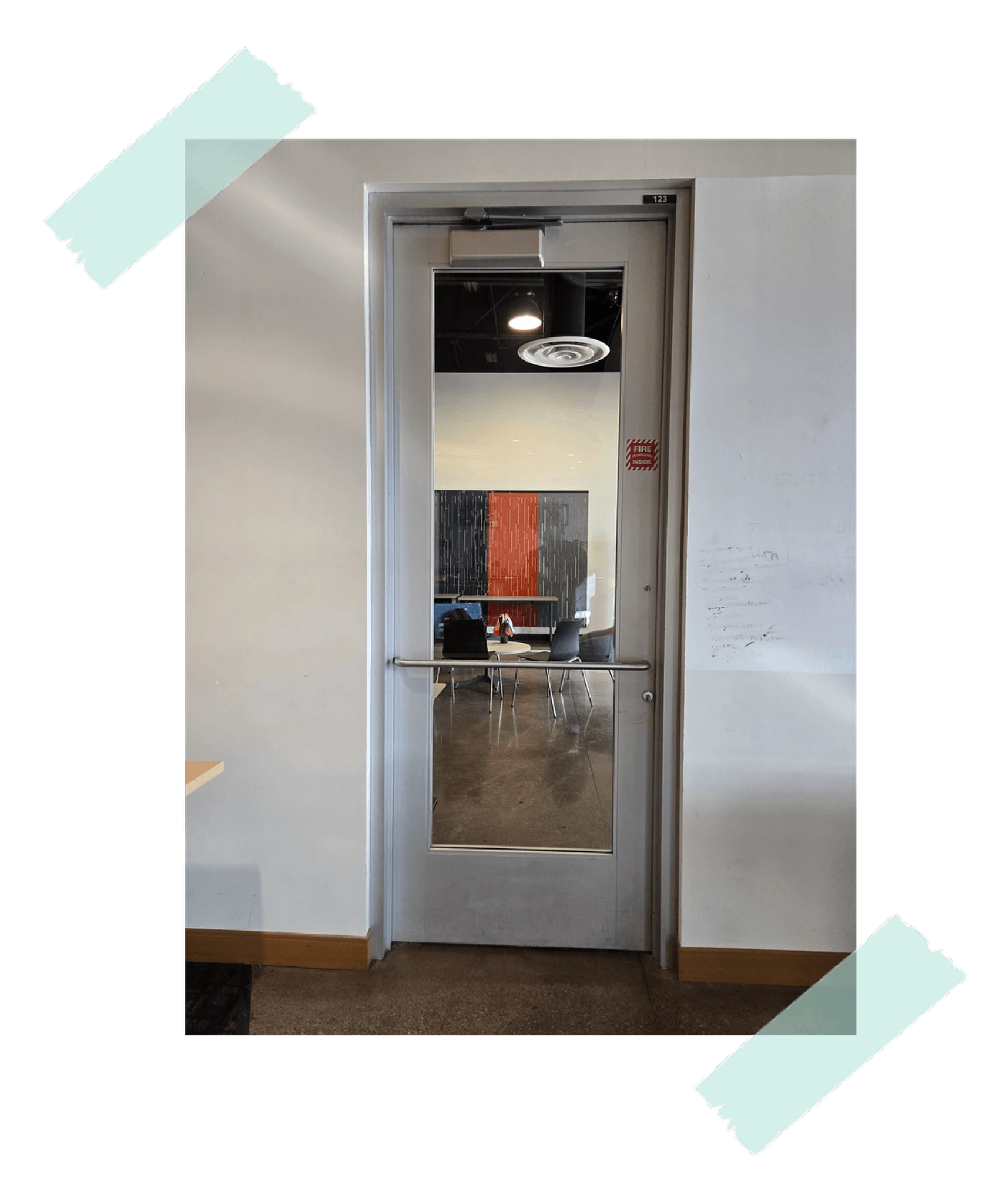
Which side should I use, and should I push or pull?
When I was new on campus, this door made me pause almost every time. I learned to push it, but the handle still made the correct side unclear.
Place a simple push plate on the side meant to be pushed. A handle is not needed there.
2
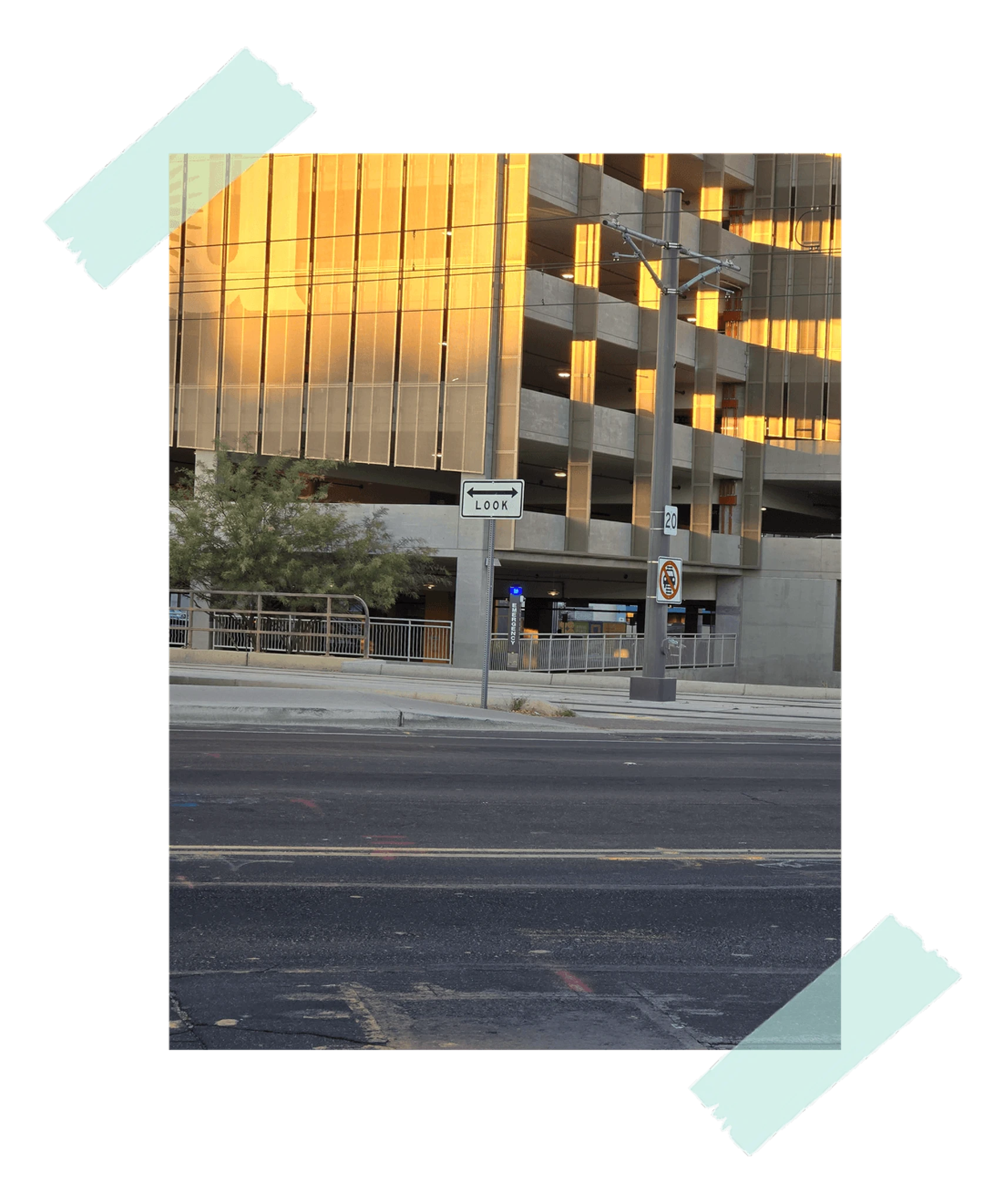
The sign says "Look two ways," but it is almost parallel to the road. Which two directions should I look?
I first looked forward and backward because the sign appeared to refer to the sidewalk. Then I realized it was pointing toward the light rail tracks.
Use a rail symbol and align the sign with the tracks so the intended direction is clear.
3
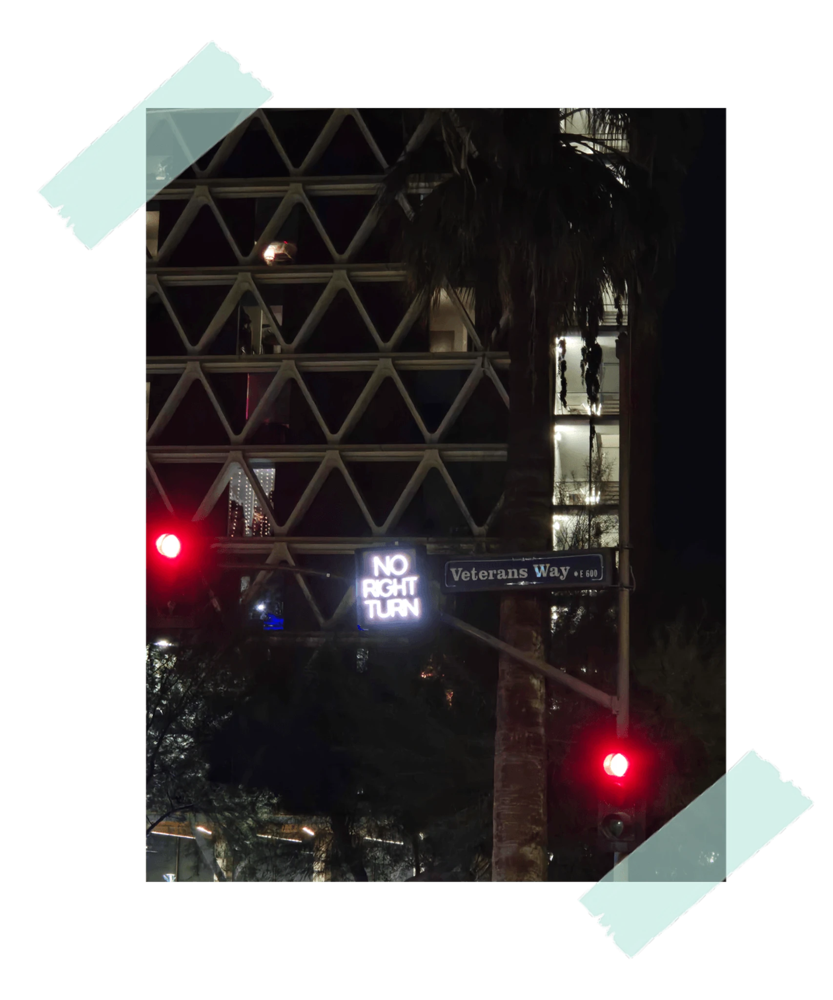
The sign takes too long to understand at a glance.
At an intersection, I needed a few seconds to understand that vehicles could not turn right at that signal. In traffic, that delay can matter.
Use a clearer traffic symbol that communicates the restriction instantly.
4
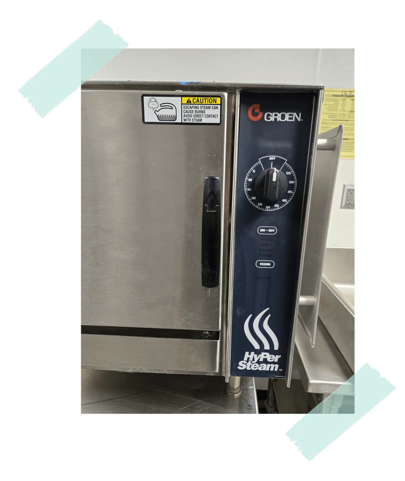
Are the numbers minutes or seconds?
I was trying to heat food and could not tell what unit the device was using. Microwaves and ovens often create this same small but frustrating confusion.
Label the unit clearly as minutes or seconds near the time control.
5
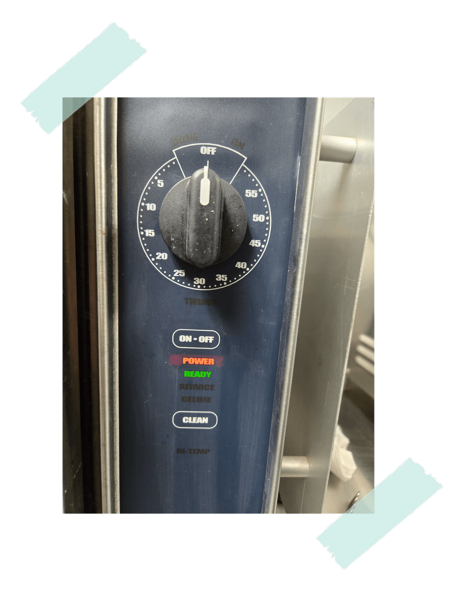
Does the highlighted "Power" label mean low power, or that the power is on?
While heating food, I wondered whether the device was warning me about battery power or simply showing that it was powered on.
Separate the power state from other labels, or use a distinct color and clearer wording.
6
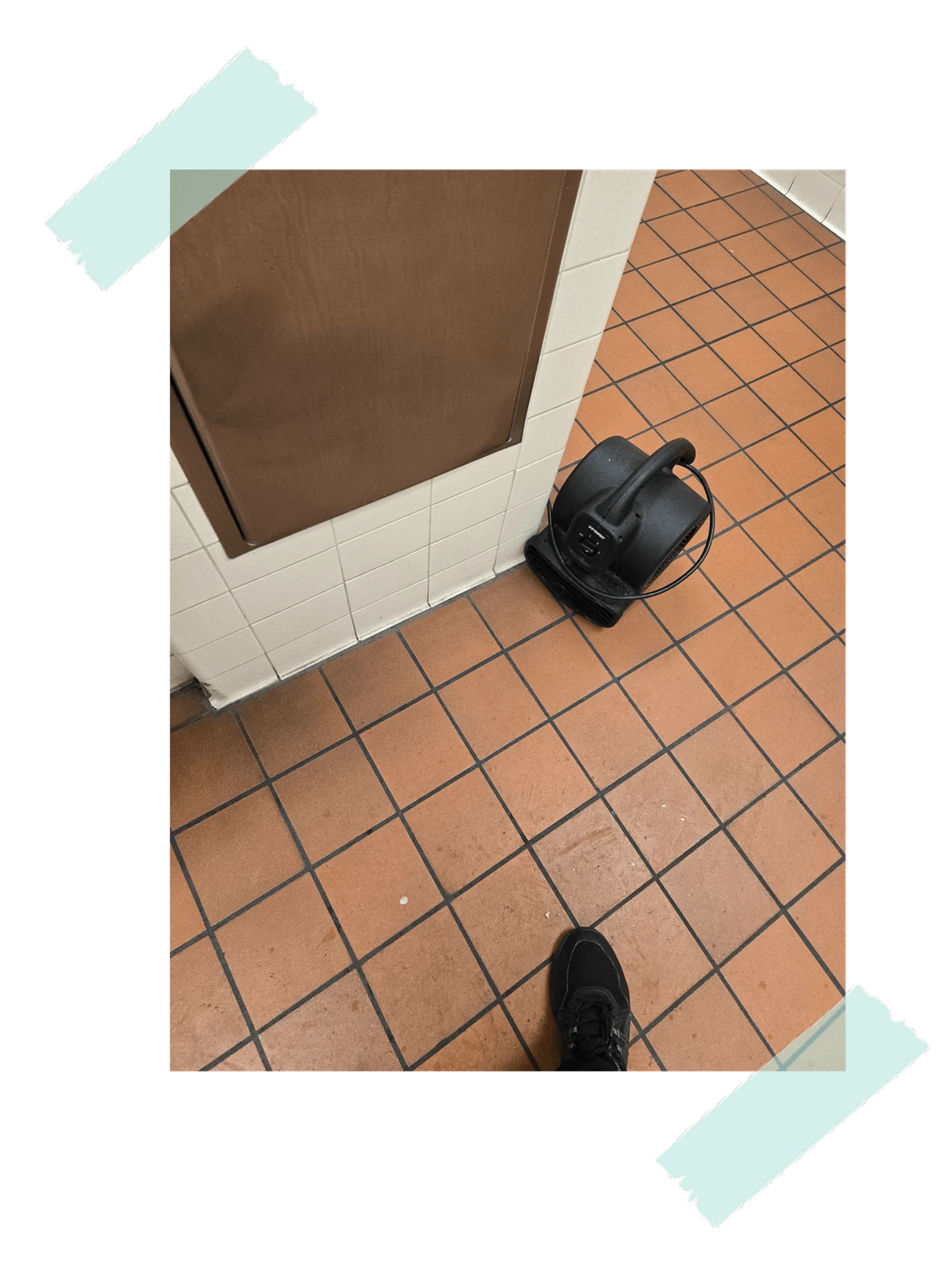
The dryer solved one problem while spreading another.
The device was drying a wet locker-room floor, but it also circulated a bad smell through the closed space.
Add a replaceable fragrance or filtration feature, and make cleaning maintenance more visible.
7
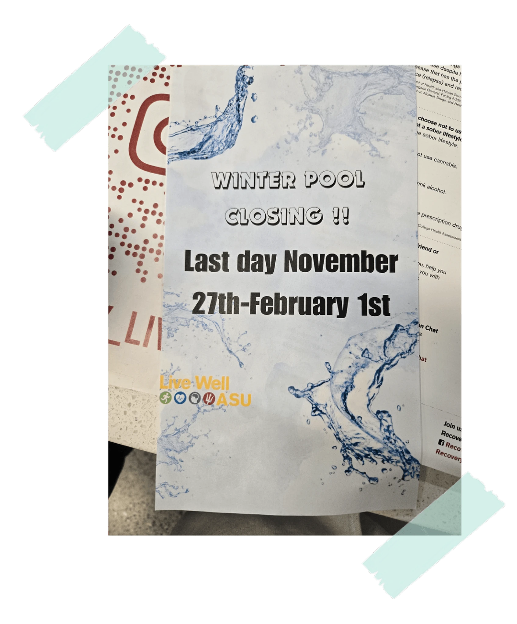
The language makes the date hard to understand.
The poster mentioned a last day but also showed a range of dates, which made the message feel contradictory.
Use one clear date statement and separate the schedule range from the final-day notice.
8
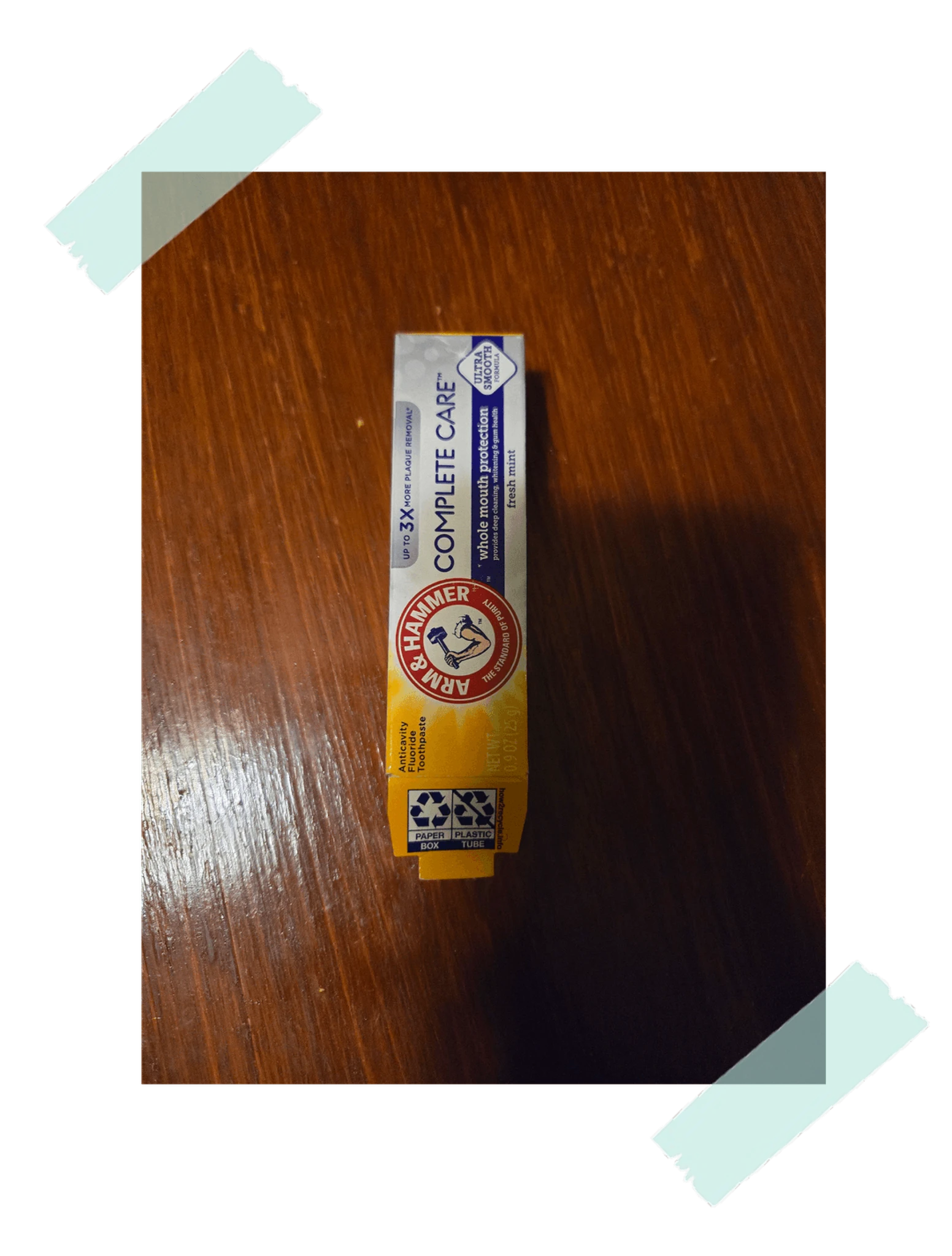
The package looks like an ointment tube.
When my knee hurt, I saw the tube quickly and thought I had found ointment. It turned out to be mouth freshener.
Use packaging that better matches the product category and avoids medical-product cues.
9
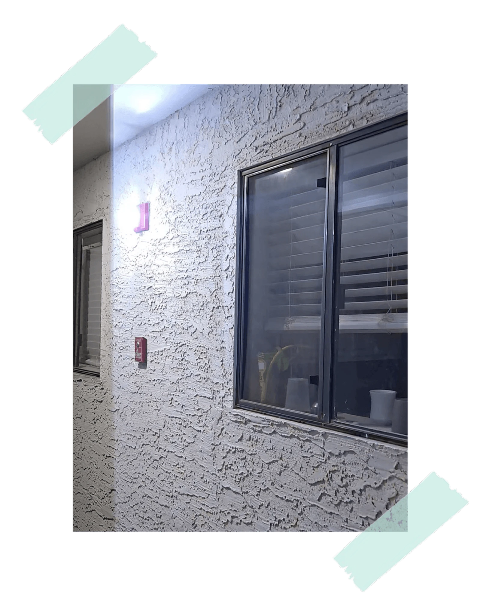
The frequency is too loud to withstand.
The alarm went off without an emergency, forcing everyone outside and interrupting work for a long time.
Keep the alarm urgent but less painful, and support false-alarm handling where possible.
10
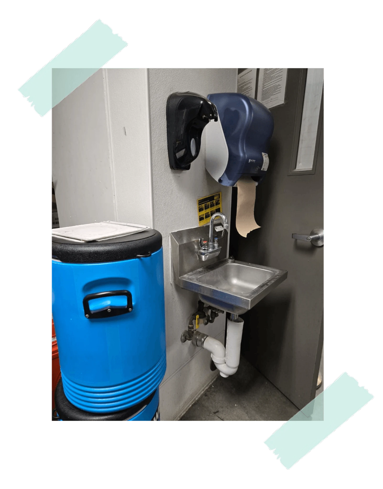
The dispenser is mounted too high for comfortable use.
Before handling food at work, I tried to wash my hands and had to bend my wrist awkwardly to press the dispenser.
Mount the dispenser at a more comfortable height for a wider range of users.
11
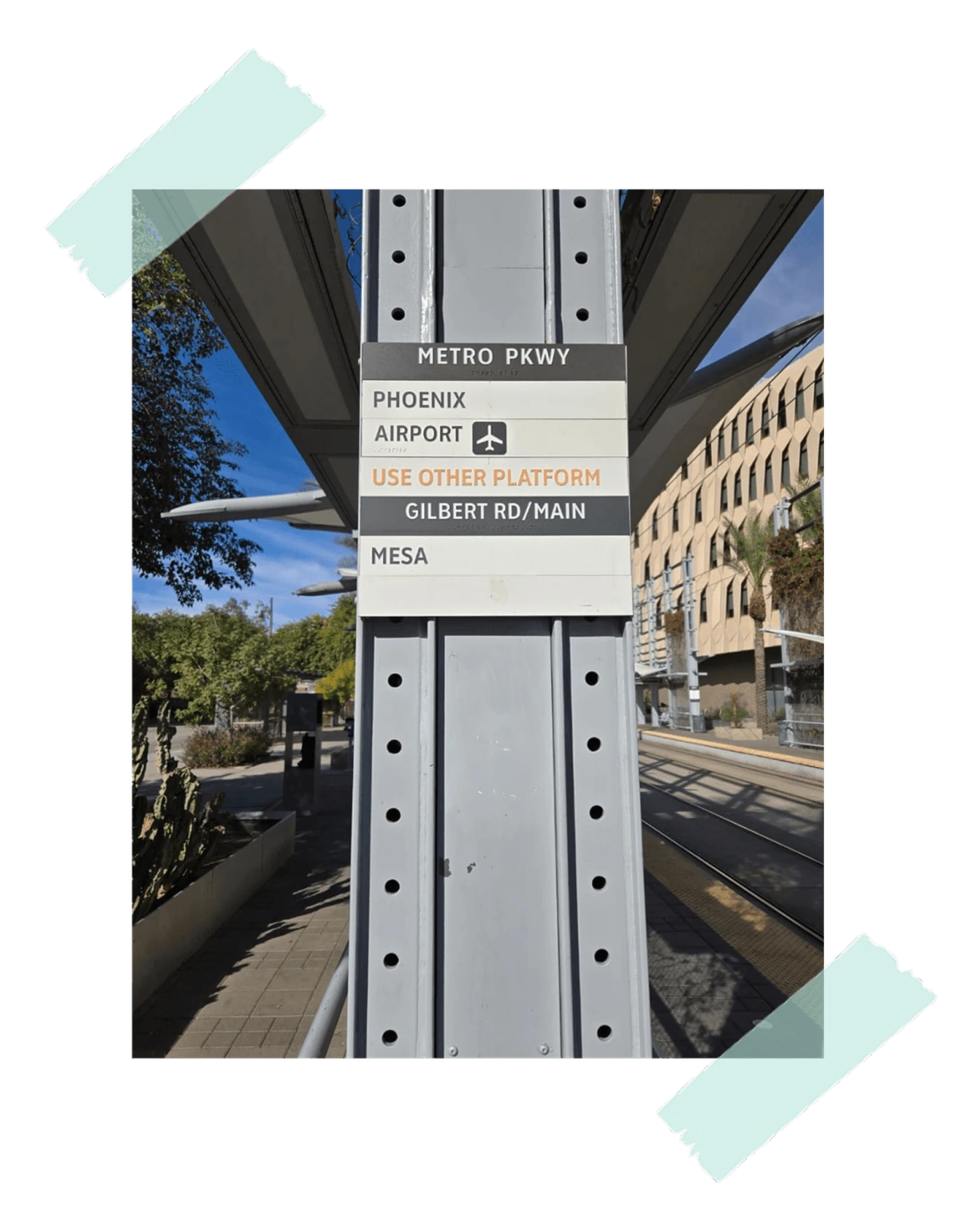
It is unclear which direction requires the other platform.
On my way to the airport, I could not tell whether Phoenix and Airport trains were on the other platform or whether Mesa was.
Separate the sections more clearly, reduce distracting black strips, and highlight "Use other platform".
12
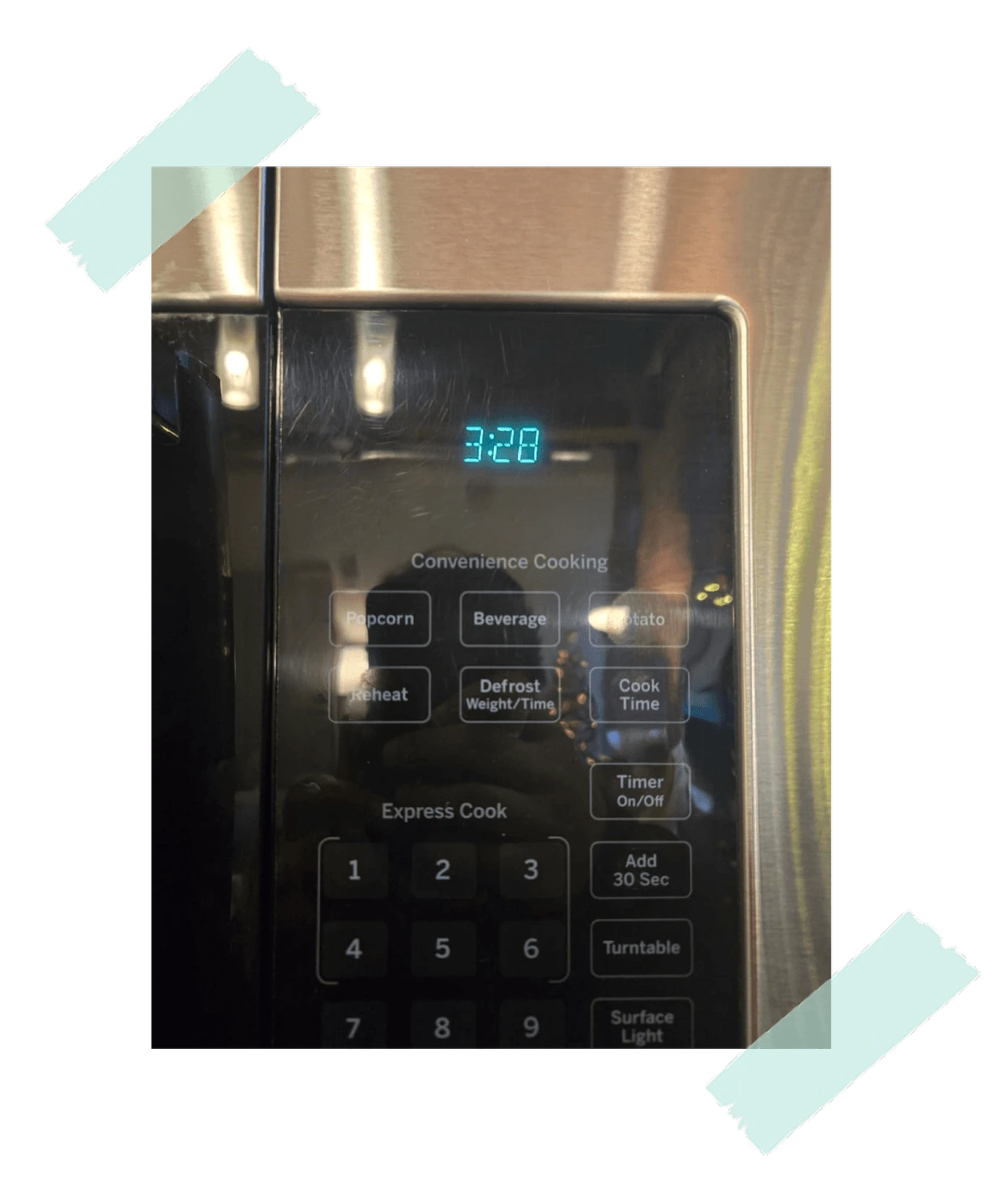
Is the display showing a countdown or the current time?
I looked back and thought the food had been heating for 3 minutes and 28 seconds. It was actually the clock.
Show AM or PM for clock mode, or visually separate clock time from active cooking time.
13
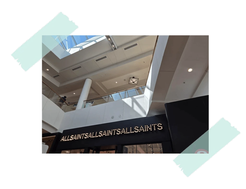
Is this a repeated shop name or a phrase trying to say something?
While shopping at the mall, the board felt confusing, unattractive, and hard to interpret as a brand message.
Use a clearer display pattern that supports recognition instead of repetition that reads as noise.
14
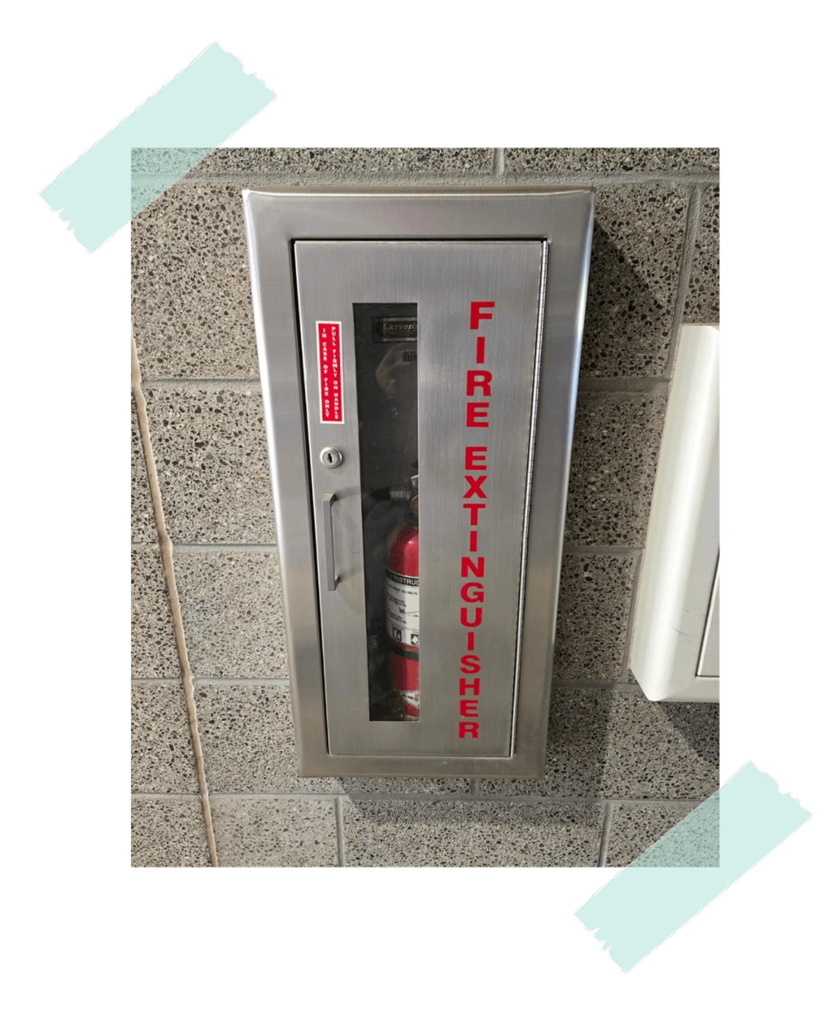
Vertical text is slower to read than horizontal text.
In an emergency, even a small reading delay matters. The vertical wording makes the label harder to process quickly.
Keep the text horizontal, legible, and fitted within the available space.
15
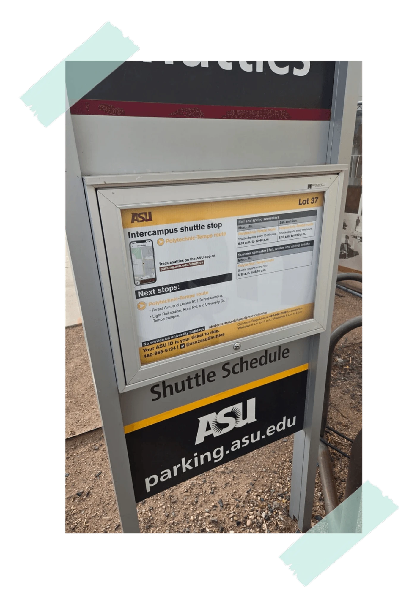
Finding the mobile app is a hassle.
While waiting under the sun for a late bus, I had to search for the app before I could track the shuttle.
Add a QR code that opens the tracking app or download page directly.
Longer explorations on UX, product design, accessibility, AI, and related topics.
A practical note on how better task framing can produce better AI outputs than changing tools or writing longer prompts.
Substack · Product Thinking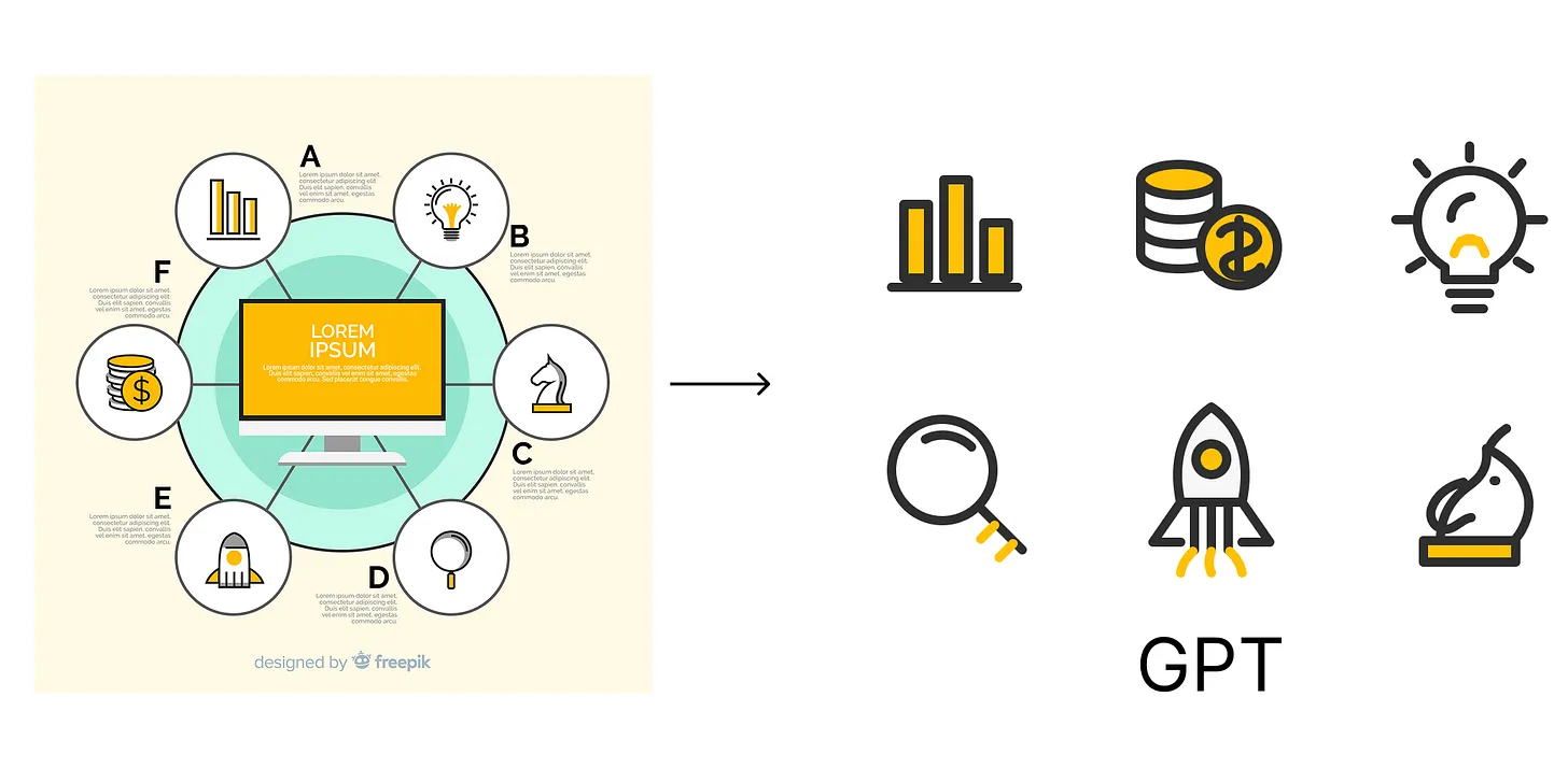
A short reflection on using rough sketches and wireframes to communicate visual intent to AI more clearly than words alone.
Substack · AI & Design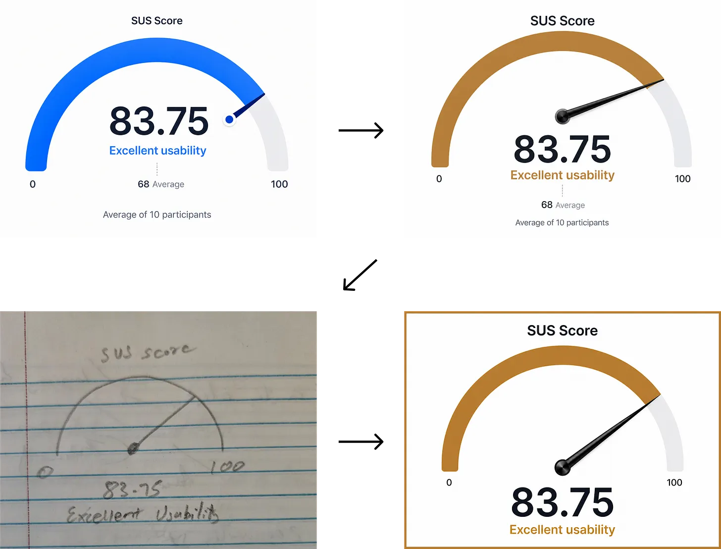
Accessibility issues often reveal deeper product and system-level problems that affect far more users than we expect.
Medium · Accessibility