Sometimes, the better result does not come from changing the AI tool.
It comes from changing how you frame the task.
I was working on a project where I had generated an image for a website. The image worked well overall, but I also wanted to use some of the icons from that image separately.
So I tried extracting the icons directly from the AI-generated image.
The result was not great.
The icons kept coming out distorted, uneven, and far from something I could confidently use.
To see whether the issue was specific to that image, I decided to run another experiment using a different visual I found on Freepik. I used it as a test case and tried the same extraction process to compare the results and better understand where the limitations were coming from.
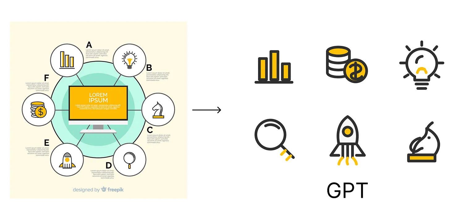
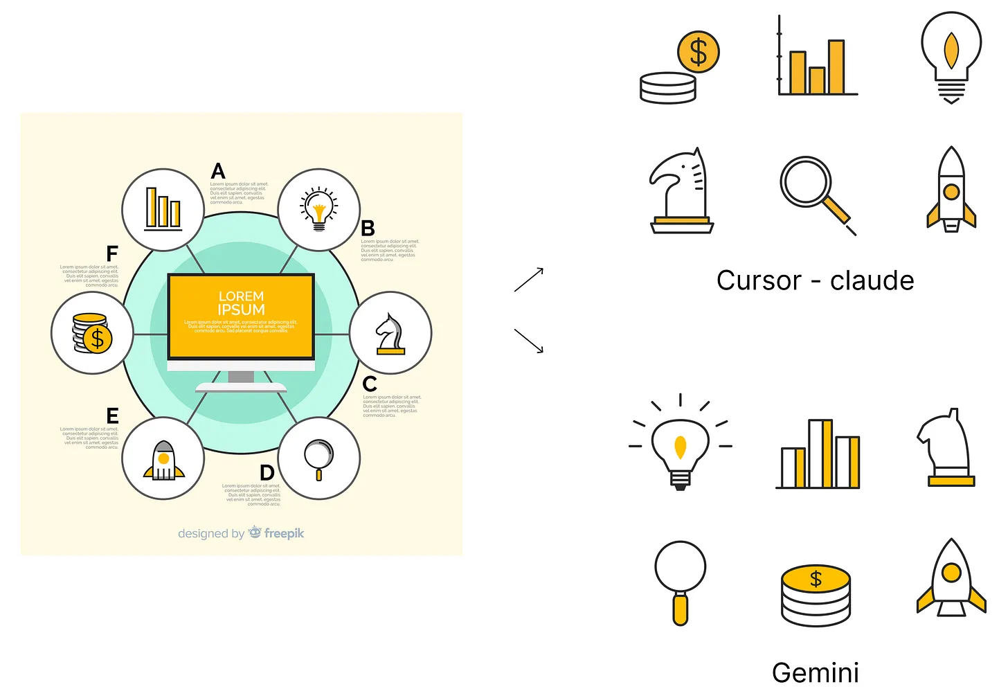
To keep the experiment fair, I used almost the same basic prompt across GPT, Claude, and Gemini - "Extract the icon and give me in SVG format. It should be exactly like the image, but in SVG. It should be perfect as I need to use it commercially."
I first tried it with GPT, then experimented with Claude and Gemini as well. But the issue stayed almost the same: the extracted icons looked off every time.
Some outputs were closer than others, but none of them felt clean enough for professional use.
Then I happened to speak with one of the Designed Minds members, Ellen Li, who also works with a bit of graphic design. She suggested something very simple:
Instead of giving the full image, crop each icon individually and try generating them one by one.
And that small change made a big difference.
The result from GPT was better than my earlier attempts, but still not perfect. The icon was usable as a direction, but it still had inconsistencies, distortion, and details that would need manual cleanup before using it professionally.
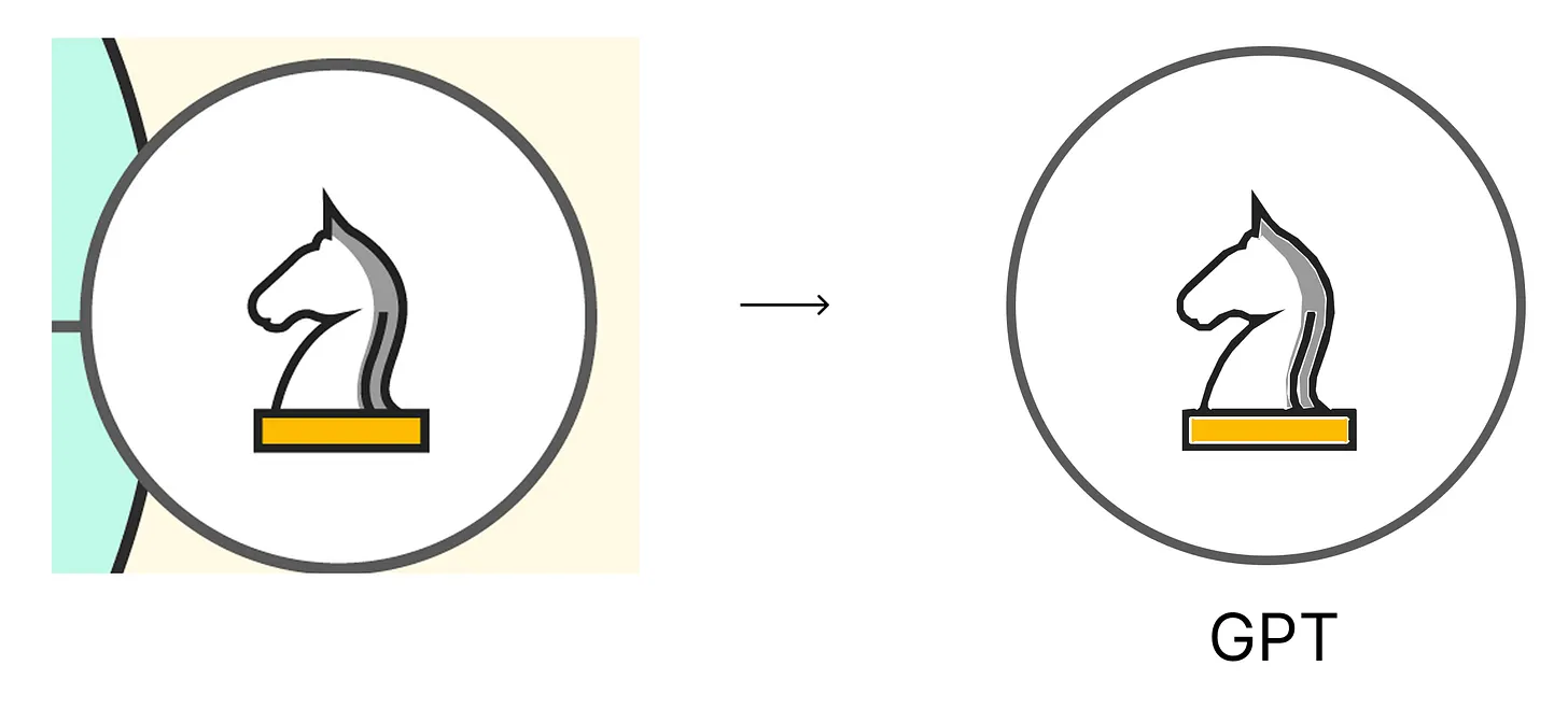
This could be a limitation of the model, my prompting approach, or simply the challenge of converting a generated raster image into a clean SVG. But maybe as these models continue to improve - and as we learn how to give them better context - we'll get closer to perfect, production-ready outputs directly from AI.
Key Takeaway
AI tools can be powerful, but the way we break down the task matters just as much as the tool itself.
Sometimes, instead of asking AI to solve the full problem at once, giving it a smaller and cleaner input can lead to a much better output.
The prompt mattered, but the input framing mattered even more.
For Designers
AI is not just about prompting.
It is also about preparing the right context.
Try This Experiment
Take one complex visual, crop out one small part, and ask AI to recreate or refine only that section.
Question for You
Would the result be better than giving it the full image at once?