
Overview
Usability research · Nonprofit
AZHARTT
Finding the friction behind completed tasks.
A usability evaluation of an Arizona animal-rescue nonprofit’s website, turning difficulties with adoption, volunteering, donations, and lost-pet help into targeted redesign recommendations.
The website under evaluation
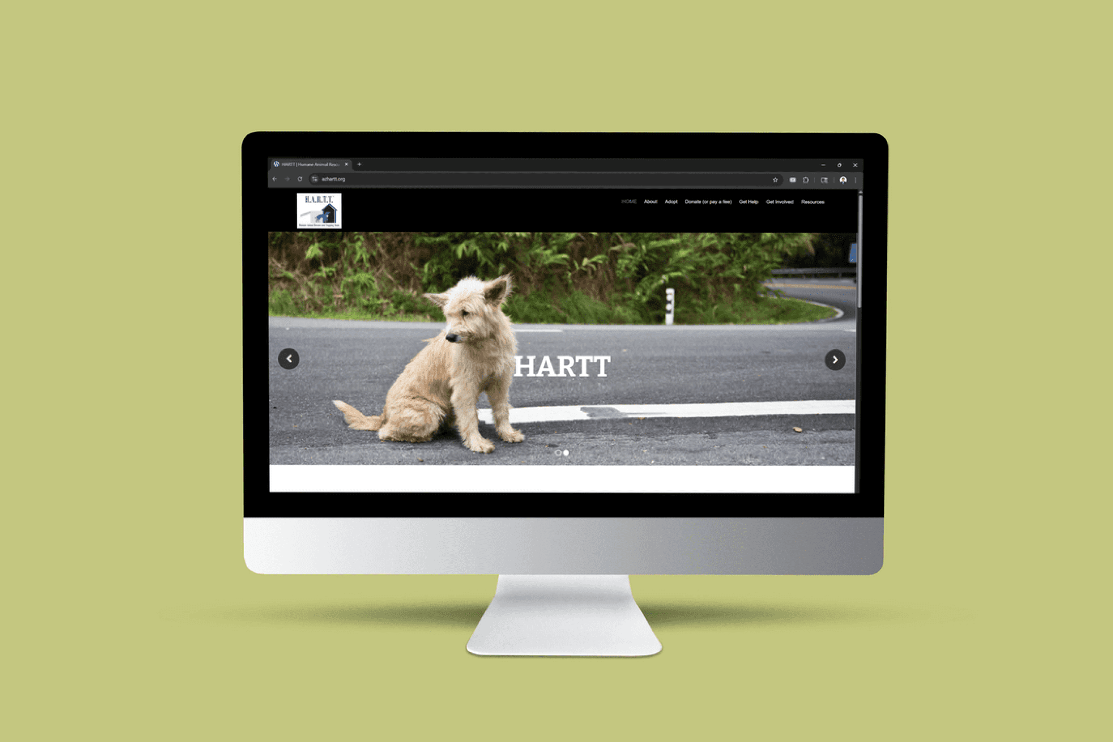
- My role
- UX Researcher / Designer
- Timeline
- March 10–20, 2025
- Study
- 5 participants · 8 tasks · 7 evaluation areas
- Methods
- Interviews, moderated usability testing, heuristic and accessibility review
- Deliverable
- Prioritized findings and annotated redesign recommendations
- AI involvement
- Limited ChatGPT support for site analysis and testing; separate from participant-based research.
My contribution
I moderated sessions, observed behavior, synthesized findings, and created redesign proposals. Participants supplied the feedback; my contribution was turning that evidence into design direction.
Problem
Finishing a task did not mean it was easy.
The study reported task completion, yet participants still encountered lost form data, unclear controls, and hidden information. The adoption journey made that gap especially visible.
- Find the right placeNavigation hid options
Participants missed dropdowns and did not associate “Programs & Services” with lost-pet help.
- Complete the formEffort could be lost
Looking up pet information outside the form could mean repeating entered data.
- Know what to do nextControls were ambiguous
Unclear date formats, a non-working signature field, and buried instructions interrupted progress.
When the survey was not enough, I changed methods.
Early survey responses lacked actionable detail. I shifted toward in-person interviews and usability sessions, supported by heuristic evaluation, to ground recommendations in observed behavior.
Eight tasks covered finding and completing four journeys: adoption, volunteering, donations, and lost-pet assistance. Form tasks stopped before submission—no real applications or payments were required.
Decisions
Protect effort first. Then make the next step visible.
I prioritized findings by severity and task impact. Four connected directions address recovering work, entering information, finding destinations, and reaching urgent guidance.
01/04Preserve effort
Let people pause without starting over.
Participants left the adoption form to look up information and lost their entries. I recommended Save & Continue Later and preserving form data across navigation before spending effort on cosmetic fixes.
Observed interface

Redesign proposal
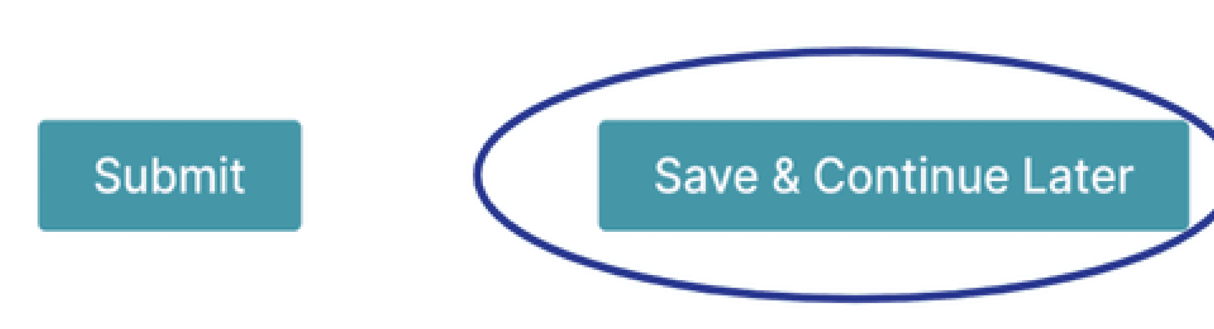
Evidence → priority: lost progress and repeated entry were classified as blockers. The image proposes a recovery action; working autosave or storage is not demonstrated.
02/04Reduce interpretation
Show valid choices instead of asking people to guess.
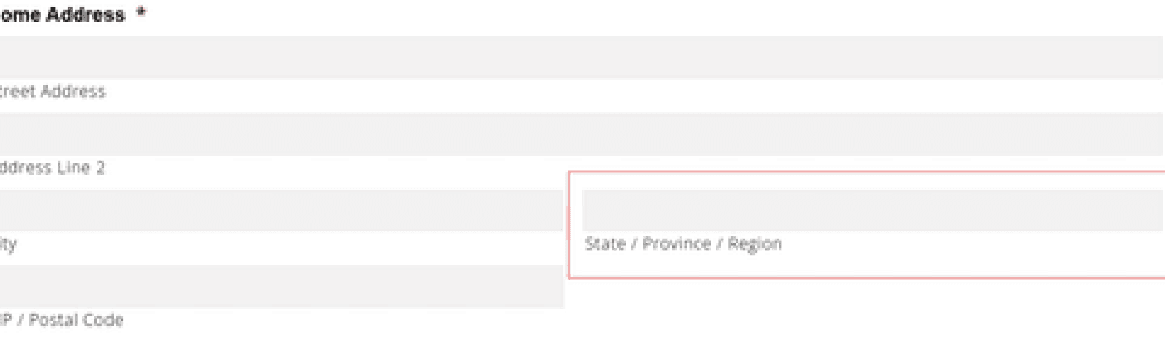
Participants had to infer date formats, type states manually, and interpret vague or incomplete questions. I recommended standard controls, clearer prompts, and an explicit “No” option where the original question required it.
Observed interface
Redesign proposal
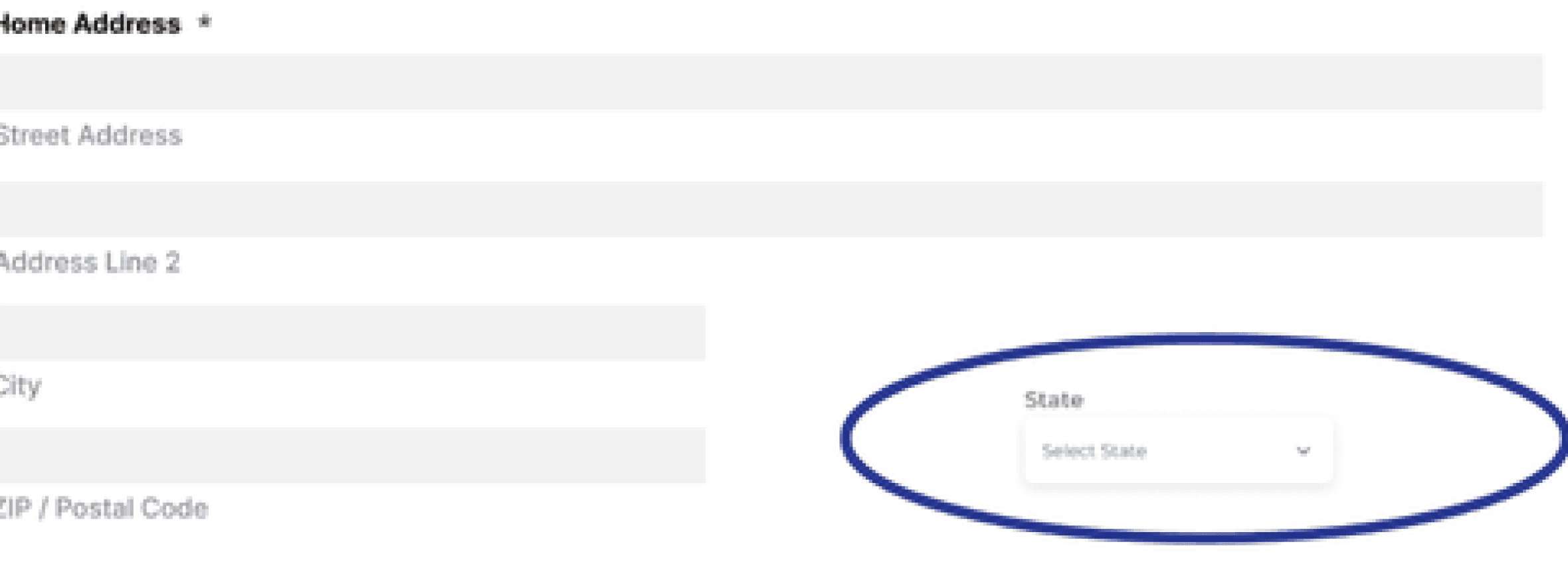
Beyond this field: the proposals include a calendar picker, “Do you own or rent house / apartment?”, and short input examples. The broken signature field was a major issue; a larger signing area with a typed-name alternative was also proposed.
03/04Make destinations recognizable
Make navigation and links look actionable.
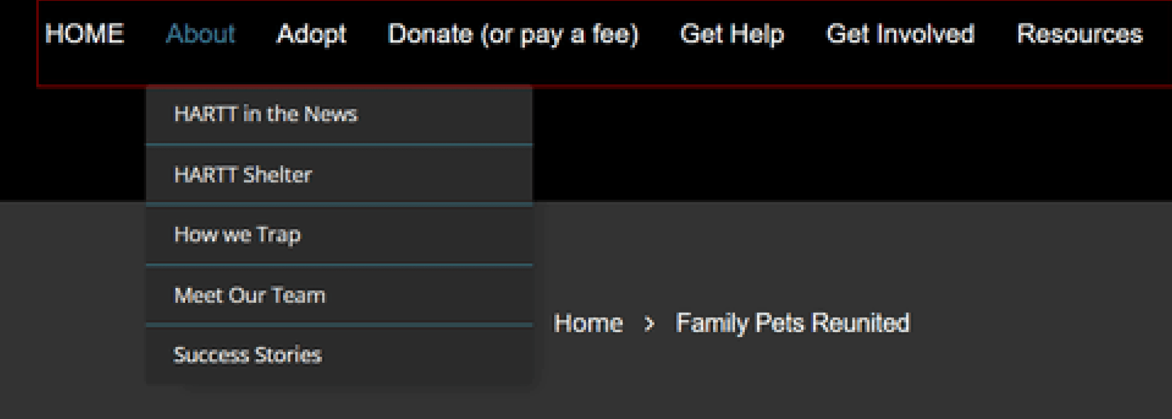
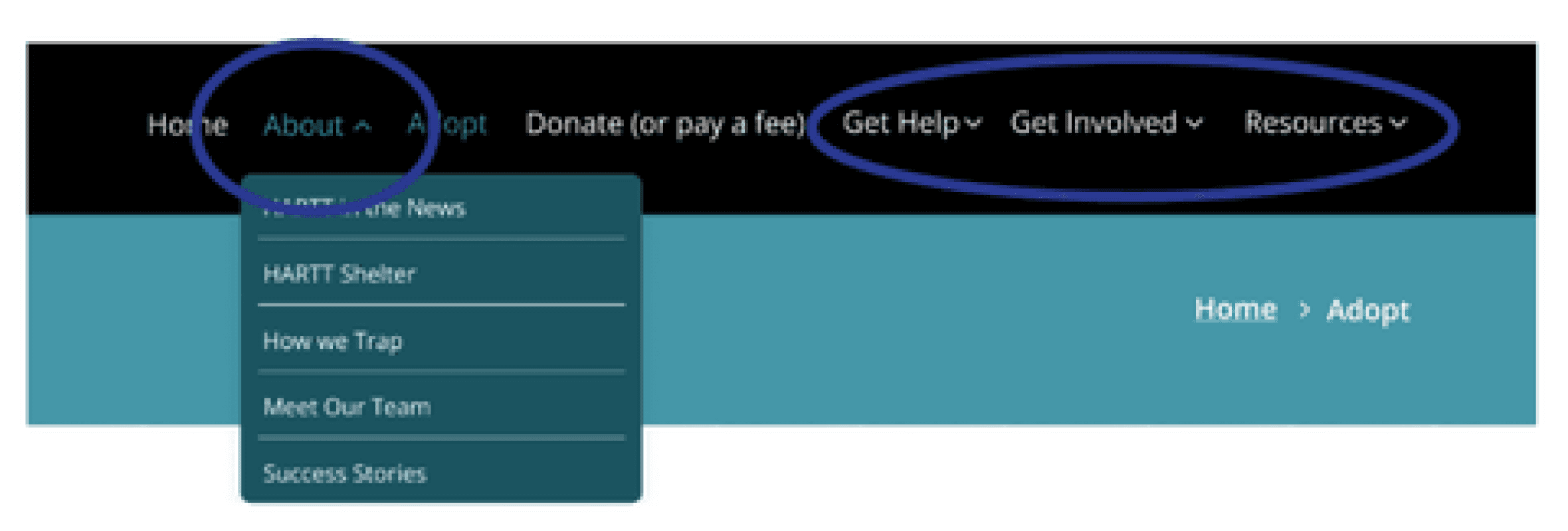
Participants missed hidden dropdowns and overlooked links that resembled body text. I added dropdown indicators in the design proposal and distinguished site navigation from the page-level bar using the existing teal theme.
Observed interface
Redesign proposal
Content follows the same rule: the proposals use underlined links, clearer breadcrumbs, larger text, and shorter sections. The accessibility review also identified contrast concerns; no post-redesign conformance result is claimed.
04/04Prioritize urgent guidance
Put lost-pet actions before the explanation.
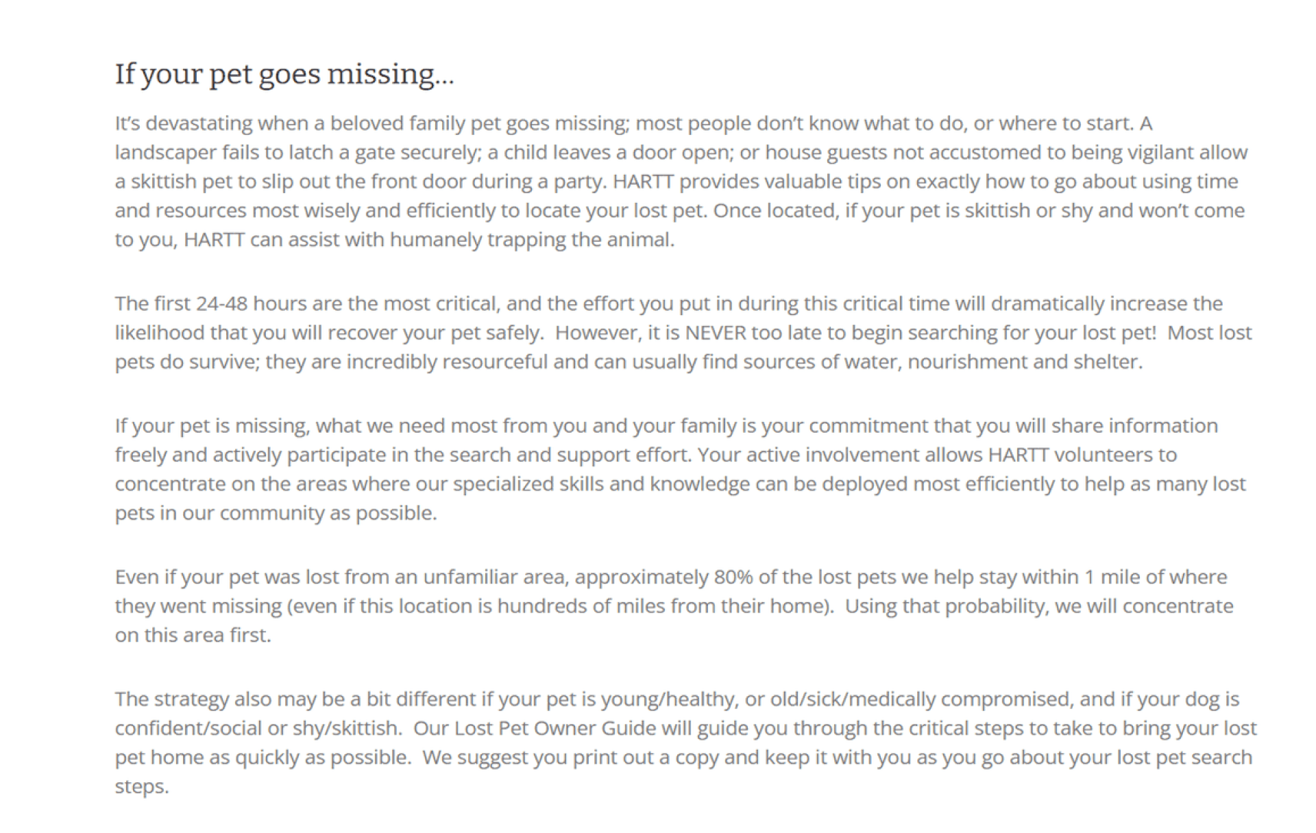
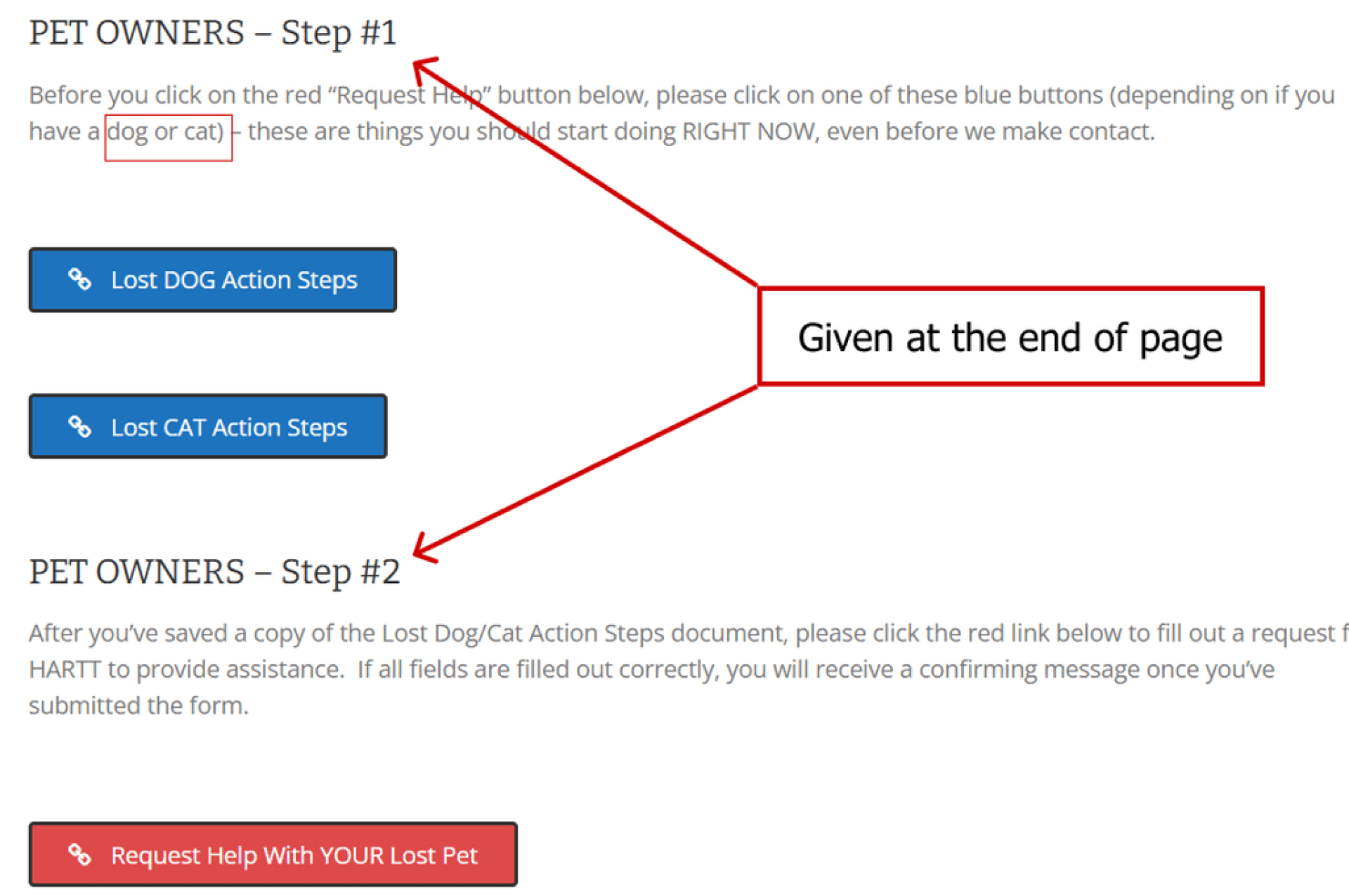
In the lost-pet journey, participants struggled to find help, while actionable instructions appeared near the end of the page. I recommended organizing the page around immediate next steps instead of making people scan introductory content first.
Observed · Introductory content
Observed · Actions near the end
Recommended information order · Not a shipped screen
- 01Immediate next step
- 02Relevant lost-pet instructions
- 03Request assistance
Why this mattered: users did not predict that “Programs & Services” contained lost-pet guidance. Both the route to help and the order of information needed attention—not just the page’s styling.
Impact
27 issues turned into a prioritized redesign direction.
The outcome was a usability evaluation and actionable design recommendations. The available evidence measures the original experience, not the effectiveness of the proposed redesign.
- Research delivered
- Moderated testing with 5 participants across 8 tasks and 7 evaluation areas documented 27 usability issues.
- Recommendations
- 19 recommendations across navigation, accessibility, forms, and task flow, with annotated examples preserved in the source record.
- Accessibility
- Review against WCAG 2.2 identified small text, poor contrast, and unclear interaction cues. This was an accessibility review, not verified conformance.
- Not established
- No deployment or post-redesign study is documented. Changes in completion time, applications, or donations remain unmeasured.
Original-study timing observations
| Task | Average time |
|---|---|
| Find adoption form | 11.8 sec |
| Complete adoption form | 19.4 min |
| Find volunteer information | 33.2 sec |
What changed in how I evaluate success
I learned to look beyond completion and examine hesitation, repeated effort, and recovery. The next step would be retesting the same tasks—not assuming that a clearer mockup proves a better outcome.