
Overview
Android UX · Music education
Soor Malhar
Less friction between signing in and learning music.
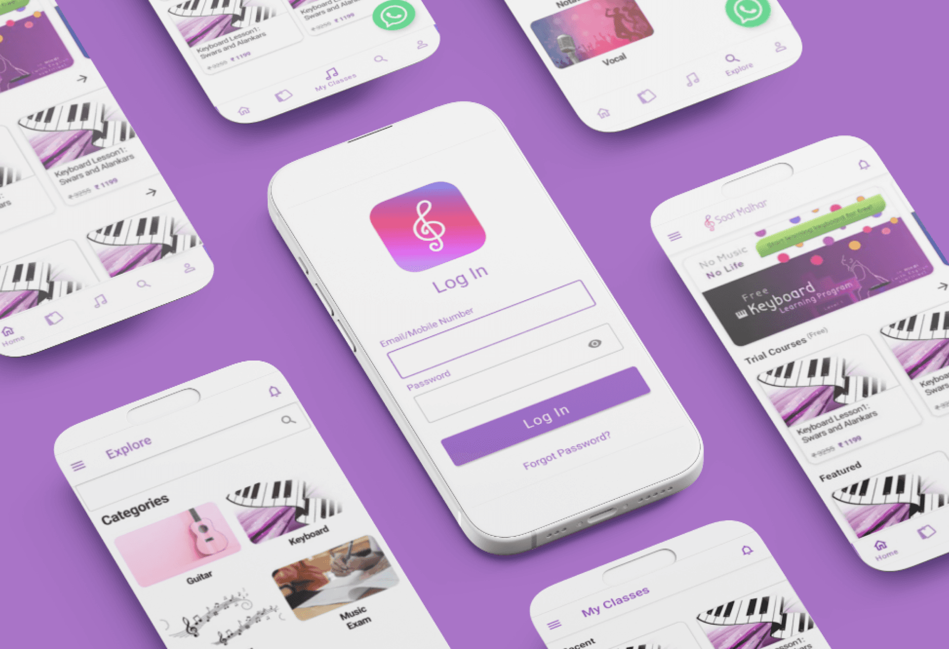
An Android app redesign focused on recovering from errors, finding enrolled courses, and understanding the next step in a lesson.
- My role
- UX/UI Design Intern
- Timeline
- May–June 2021
- Tools
- Figma · Android Studio · Jetpack Compose
- AI involvement
- None. I did not use AI tools on this project.
My contribution
I explored and refined the interface in Figma and implemented core Android UI screens in Jetpack Compose. Mentor feedback helped me move from adding features to improving everyday usability. The existing app and its learning content were the starting point, not my original product.
Problem
Learning was not the only thing users had to figure out.
The original interface made people interpret errors, hunt for enrolled classes, and distinguish controls from decoration. The redesign focused on those recurring tasks before expanding the feature set.
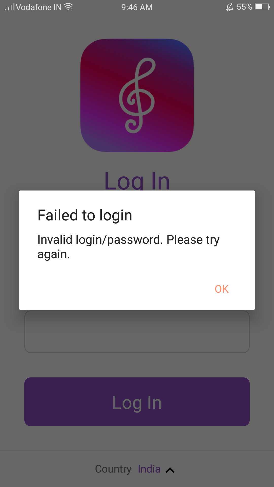
- EnterErrors away from the field
A blocking dialog separated the problem from the input that needed attention.
- FindClasses without a clear home
Enrolled courses competed with discovery content on the home screen.
- ContinueUnclear interaction cues
A completion indicator resembled loading; non-interactive cards looked tappable.
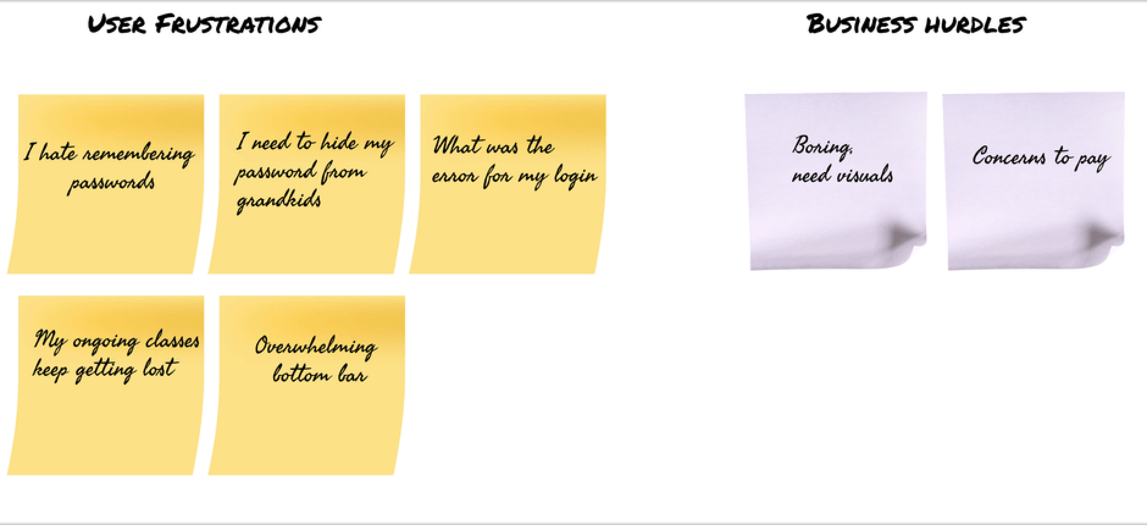
These artifacts informed the design direction; they are not evidence of measured usability improvement.
Decisions
Make the path back to learning easier to recognize.
Four connected decisions follow the core journey: sign in, return to a class, assess a course, and continue a lesson. These are documented design iterations, not results from a controlled user test.
01/04Enter · Recover
Put the error where it can be fixed.
I replaced the all-errors dialog with field-level messages and outlines. Labels and password guidance stay visible so learners do not have to remember instructions while typing.
Before
Redesign
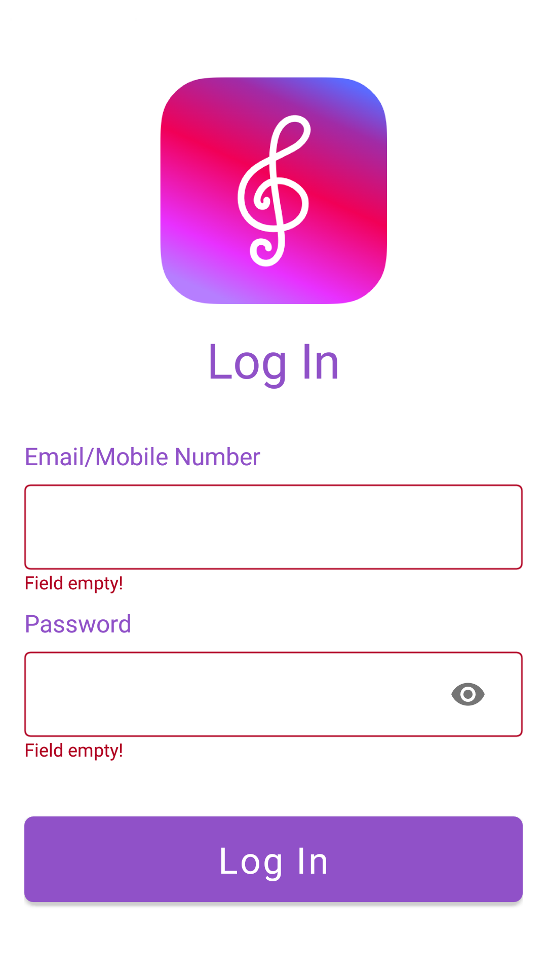
Iteration: I removed the extra confirm-password field from the signup exploration to avoid repeated entry and retained password visibility control. Social sign-in remained a feature suggestion, not a delivered integration.
02/04Find · Return
Give enrolled classes their own destination.
My Classes replaced notifications in the bottom navigation; notifications moved to the top bar. Recent lessons sit above the enrolled-course grid, making resuming and browsing distinct tasks.
Before · Notifications

Redesign · My Classes

My Classes
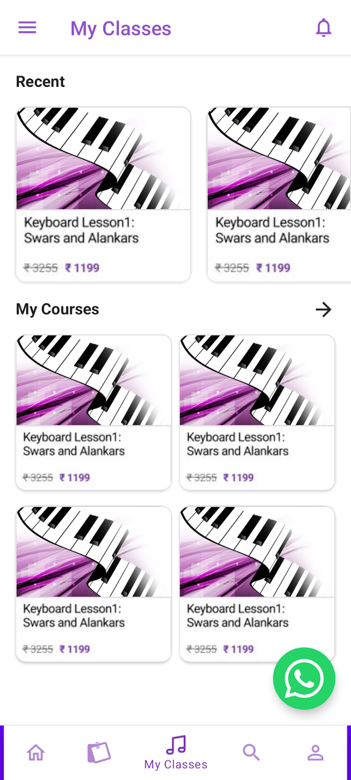
One destination, two intentions
Resume: recent lessons are grouped first.
Browse: enrolled courses remain visible below.
The earlier list layout was revised because its course images were not working well in that format.
Trade-off: move a less central destination out of the bottom bar without removing access to it. Home can focus on discovery instead of duplicating enrolled courses.
03/04Assess · Choose
Let the course content carry the hierarchy.
I grouped course facts, learning goals, and the description into a clearer reading order. Removing card-like styling from static information reduced false affordances; reviews retained their interactive treatment.
Before
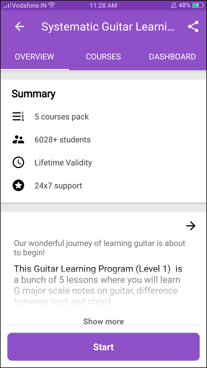
Redesign
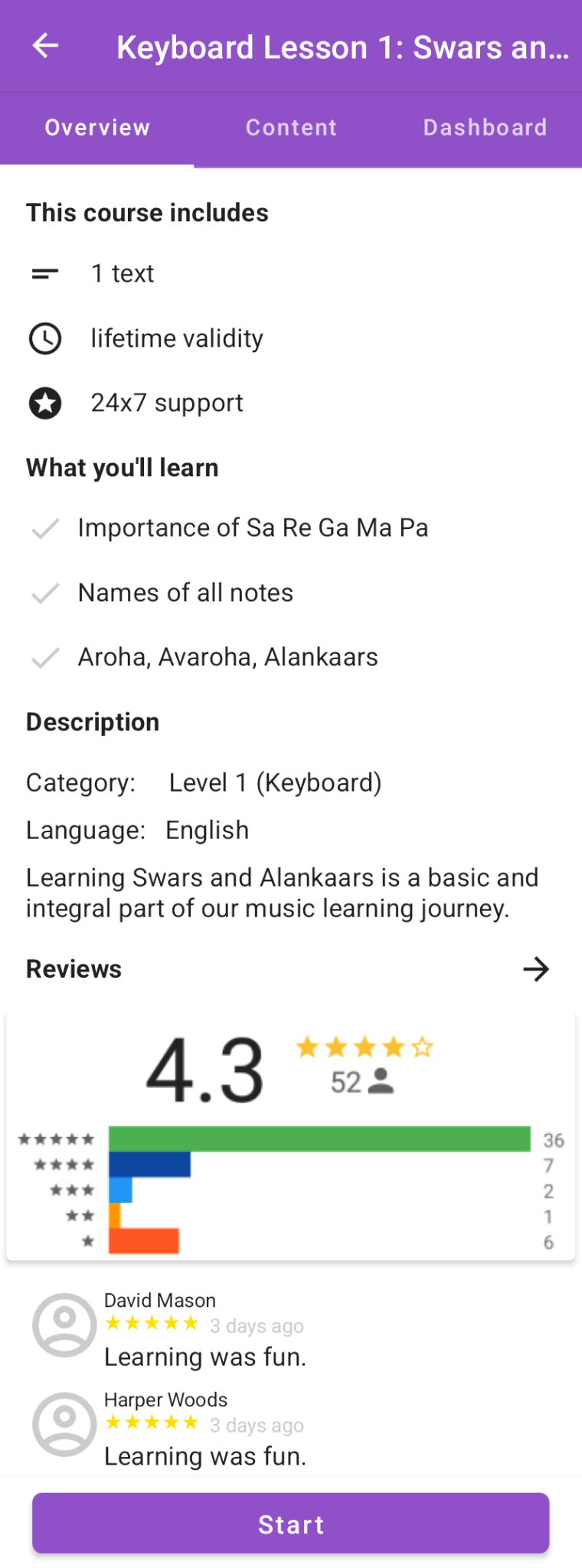
Refinement: I tried an orange start action in an earlier visual iteration, then returned to the brand color. Ratings, student counts, and other screenshot values are example course content—not redesign outcomes.
04/04Continue · Recover
Make the next action unmistakable.
In lessons, consistent Previous and Next controls replaced inconsistent navigation, and I removed a completion indicator that looked like loading. The same principle shaped the offline state: one clear recovery action.
Before
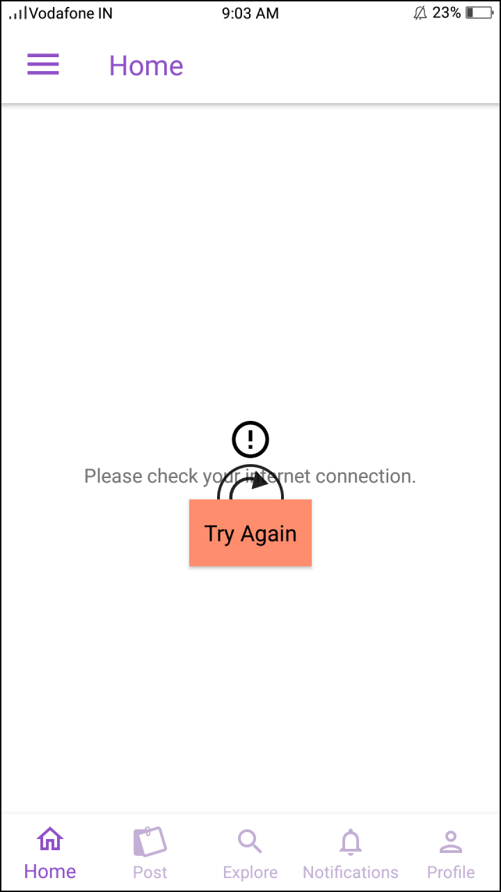
Redesign
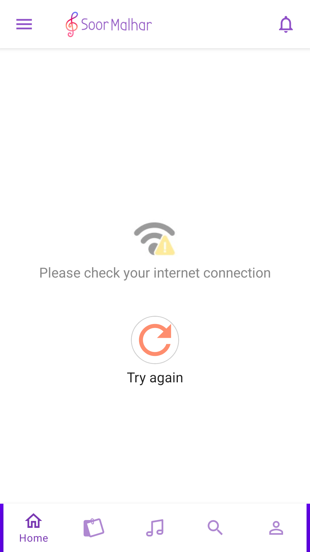
Across the lesson flow: I also moved comment composition away from a blocking dialog toward an input attached to the keyboard. These are documented interaction decisions, not validated completion-rate gains.
Impact
Core flows redesigned. Native UI built.
The project delivered design iterations and Android UI implementation—not a measured improvement in engagement, learning, or task success.
- Design delivery
- The existing project record lists approximately 20 explored or redesigned screens. The source document preserves original screens, intermediate versions, and final design decisions.
- Android UI
- The existing record lists 8 core screens implemented in Jetpack Compose. This describes UI work, not a complete backend integration or a verified production release.
- Testing & outcomes
- No documented participant count, before/after usability measurement, or verified engagement lift is available. I do not attribute product-impact metrics to this redesign.
Explorations beyond the core journey
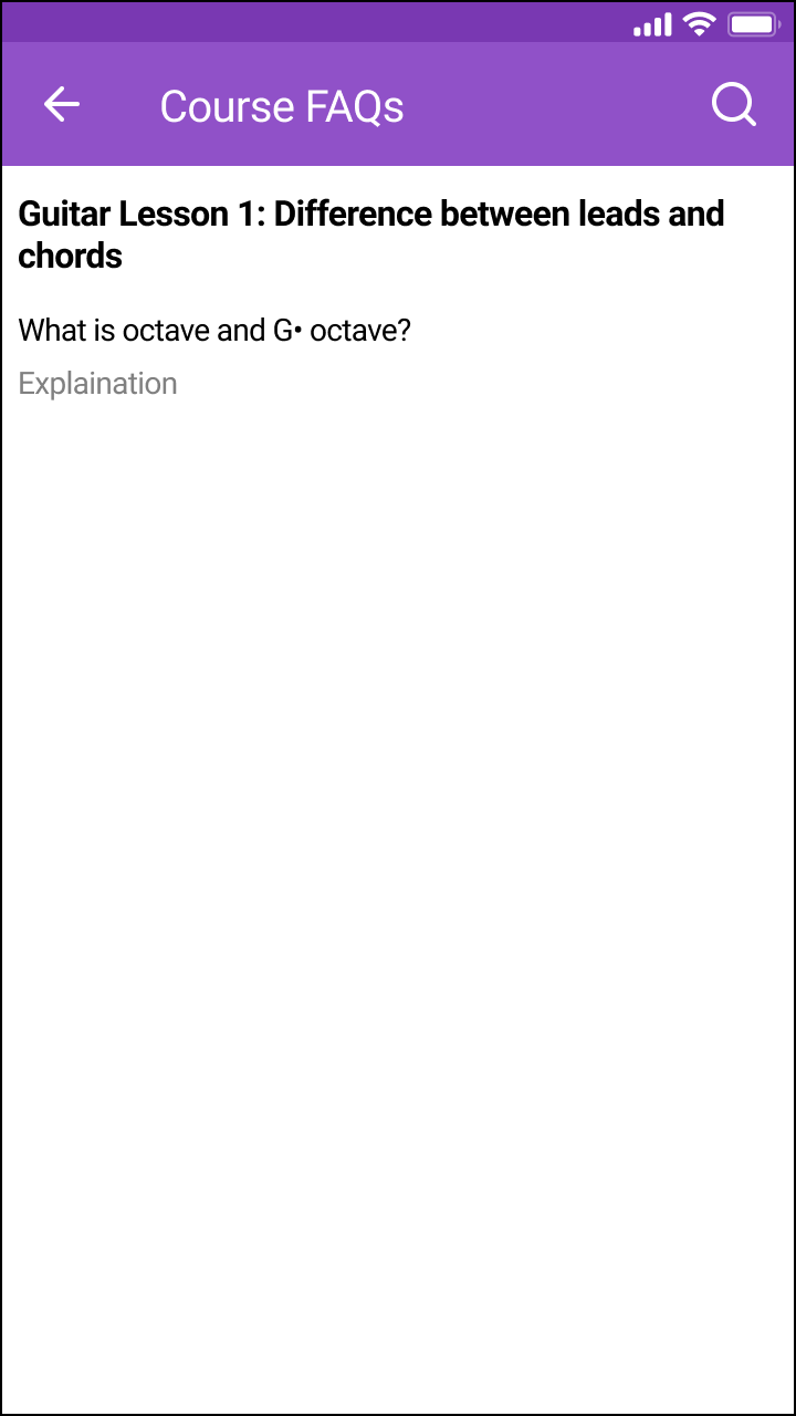
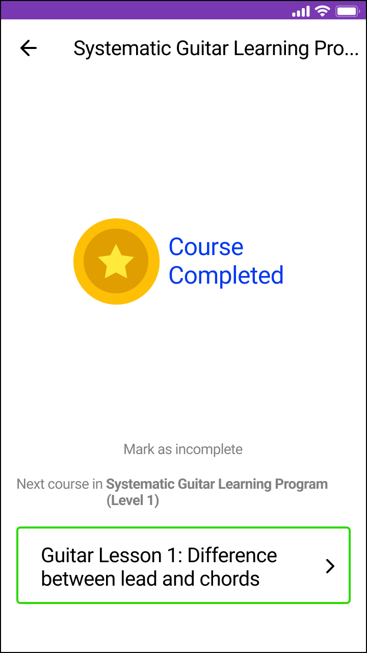
The project also explored a wishlist, saved posts, course FAQs, progress reporting, and completion feedback. Social login, voice search, and XP-based ideas were proposals rather than verified shipped functionality.
Course FAQs · Exploration
Completion feedback · Exploration
What I took forward
More features did not automatically make a better learning experience. The useful shift was to clarify errors, navigation, and action cues first, then carry that intent from Figma into native Android UI.