
Overview
Accessibility audit · Animal rescue
Access to help should not depend on how you browse.
AZHARTT Accessibility
A three-page WCAG 2.2 AA audit of HARTT’s animal-rescue website, translating barriers to reading, navigation, and form interaction into a prioritized remediation roadmap.
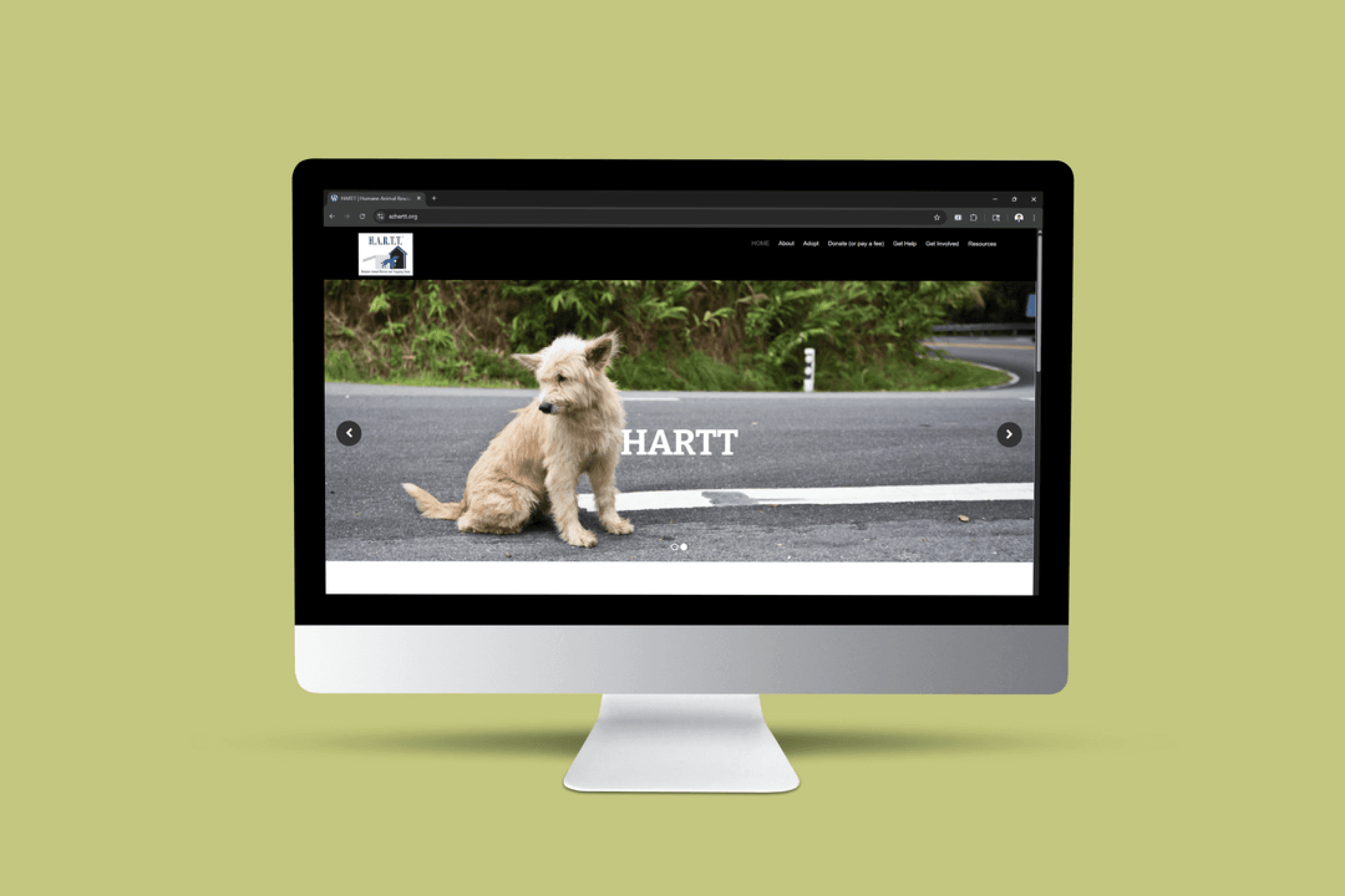
The website under review
- My role
- UX Evaluator + Accessibility Reviewer
- Scope
- Home · Lost Pet Help · Found Pet / Reuniting Pets & Families
- Framework
- WCAG 2.2 Level AA · POUR principles
- Deliverables
- Annotated Figma findings, pattern analysis, prioritized recommendations
- AI involvement
- AI supported analysis and documentation. GPT also helped explain complex criteria through practical examples.
- Outcome boundary
- Audit findings and proposed remediation—not verified implementation or conformance.
My contribution
I evaluated the three pages, mapped findings to accessibility criteria, annotated the evidence in Figma, and grouped recurring barriers into component-level recommendations. This is a separate standards-based audit from the five-participant AZHARTT usability project.
Problem
Essential rescue information had barriers beyond visual layout.
Missing labels, invisible focus, and low contrast could make the same page difficult to understand or operate through different access methods. The audit traced these barriers across three service pages.
- Understand the pageMeaning was not always available
Missing image descriptions, inconsistent headings, and unnamed controls affected assistive-technology navigation.
- Move through a taskKeyboard access broke down
The report flagged hover-only menus, absent focus indicators, missing skip links, and a popup keyboard trap.
- Read and actImportant cues were hard to perceive
Low contrast, color-only states, and small targets affected reading and interaction.
A scoped audit, not a disability-user study
The findings describe barriers identified during evaluation. The supplied record does not document testing with disabled participants, a named screen-reader test setup, or a post-remediation validation study.
Decisions
Turn technical findings into fixes a team can act on.
I organized the work around recurring barriers and their consequences for access, rather than treating each screenshot as an isolated defect.
01/04Find the pattern
Fix recurring barriers at the component level.
Missing names, invisible focus, and contrast problems recurred across the reviewed pages. I grouped these into system-level recommendations for navigation, controls, image handling, and typography.
| Pattern | Home | Lost pet | Found pet |
|---|---|---|---|
| Image text / control names | Reported | Reported | Reported |
| Visible focus missing | Reported | Reported | Reported |
| Color / contrast barriers | Reported | Reported | Reported |
Three recurring patterns reported across all reviewed pages. This scoped comparison is not a whole-site conformance result.
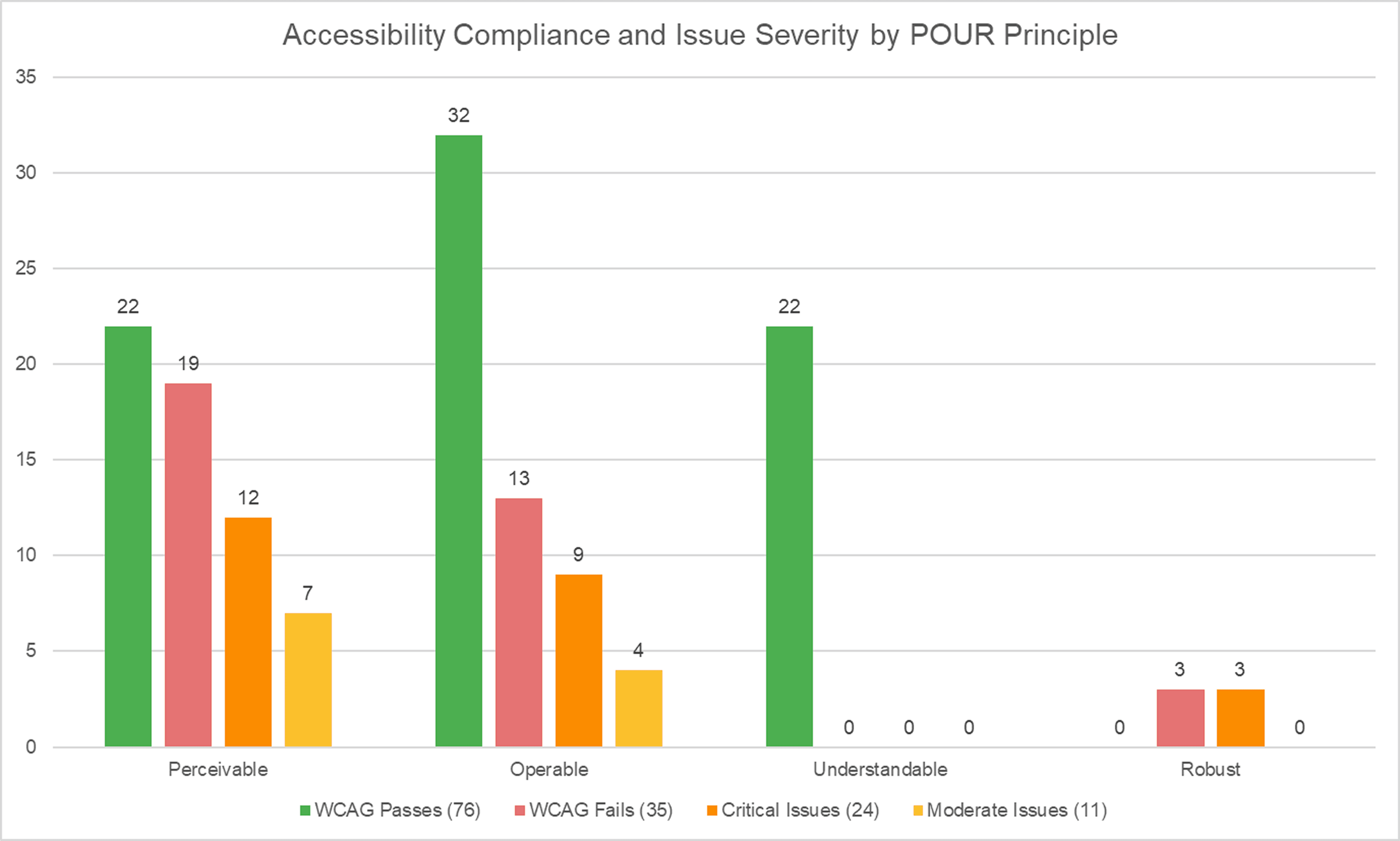
Design judgment: address repeated component behavior first, while keeping page-specific issues traceable. No failures recorded under Understandable in this sample does not establish full coverage or conformance.
02/04Restore control
Keep the keyboard path open.
The report identified hover-only navigation and a Found Pet popup that could trap keyboard users. I prioritized keyboard-operable controls, visible focus, a skip link, and a keyboard-accessible exit.
Found Pet · Original page and annotated wireframe
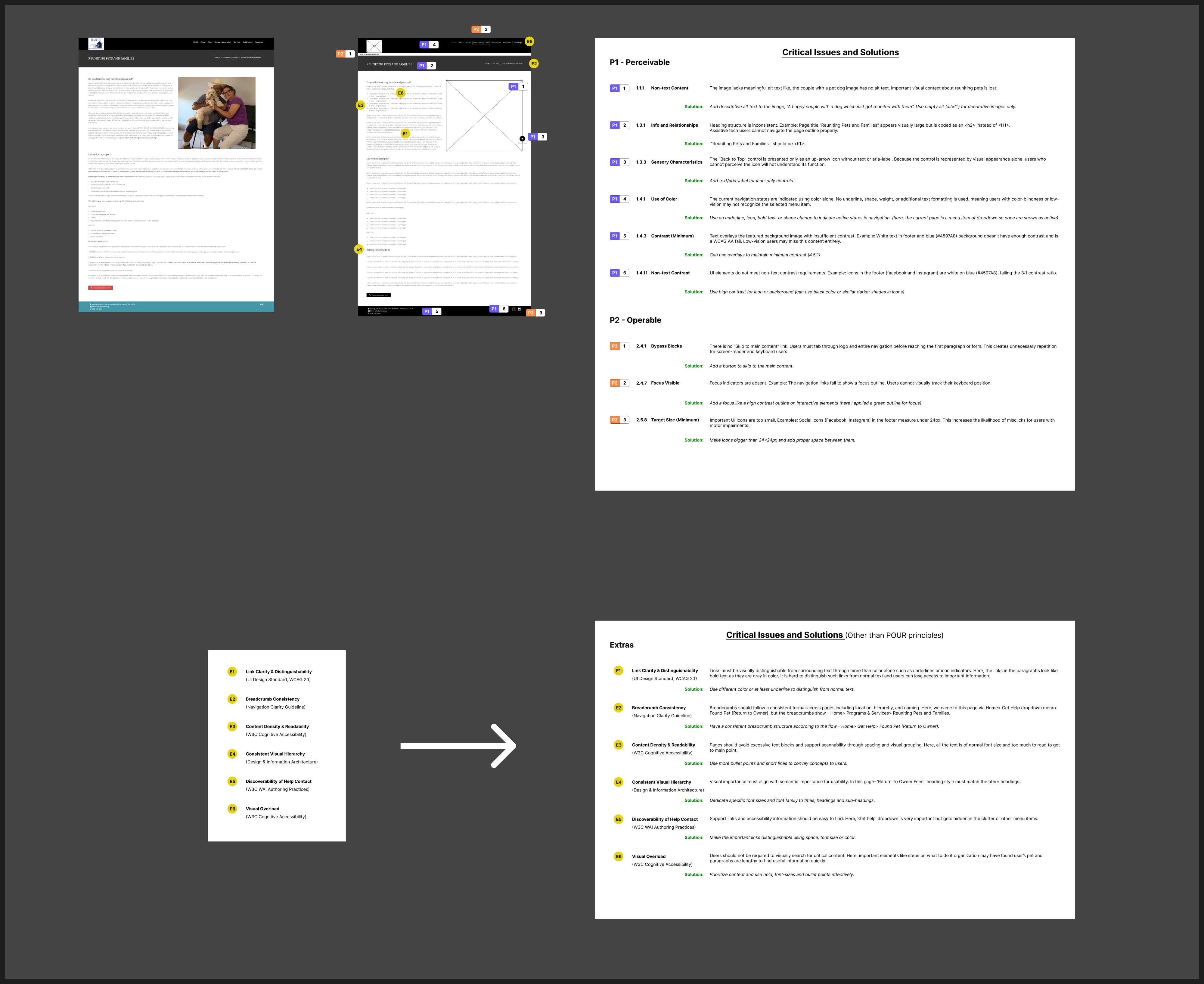
Recommended keyboard path · Not an implemented demo
- EnterReach the control
- NavigateKeep focus visible
- LeaveExit without a trap
Priority rationale: an inaccessible exit can block a task entirely. The recommendation is documented; a repaired modal and successful retest are not.
03/04Expose meaning
Expose meaning, not just visual hierarchy.
I recommended descriptive alternatives for informative images, empty alternatives for decorative images, logical headings, and programmatic names for icon-only controls. The annotations connect each issue to a specific part of the page.
Home · Original page and annotated wireframe
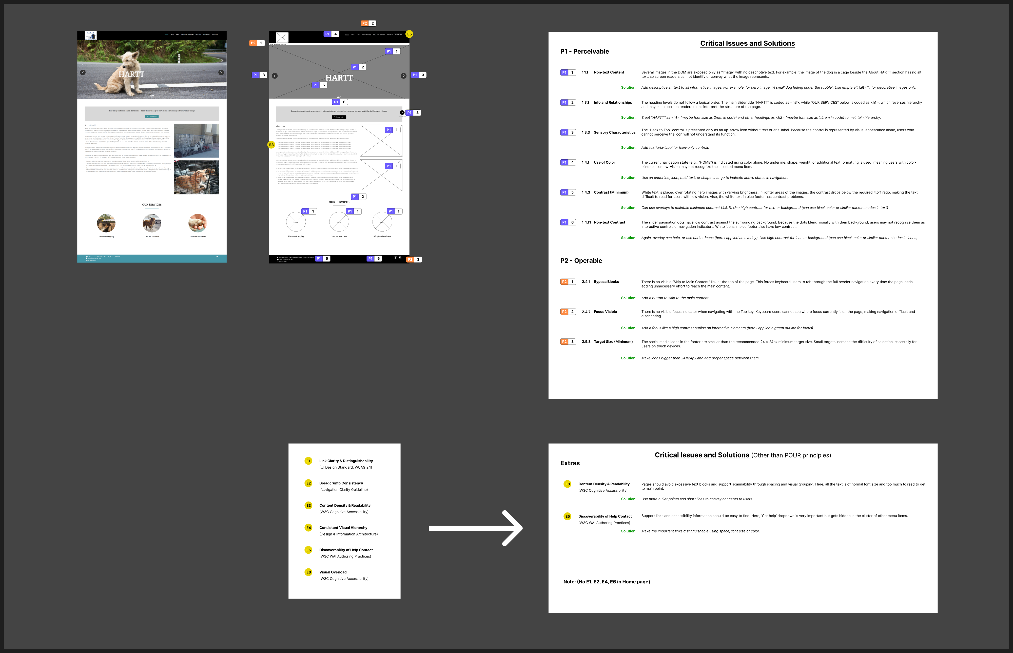
Recorded heading structure
H3 HARTTH1 Our Services
Recommended hierarchy
H1 HARTTH2 Our Services
Separate appearance from semantics: larger-looking text is not automatically a heading. I made both the observed structure and the proposed hierarchy explicit for implementation.
04/04Support perception and input
Make states and controls easier to perceive.
The audit flagged hero/footer contrast, color-only states, small secondary controls, and missing input-purpose attributes. I recommended stronger contrast, non-color state cues, adequately sized or spaced targets, and appropriate autocomplete metadata.
Lost Pet Help · Original page and annotated wireframe
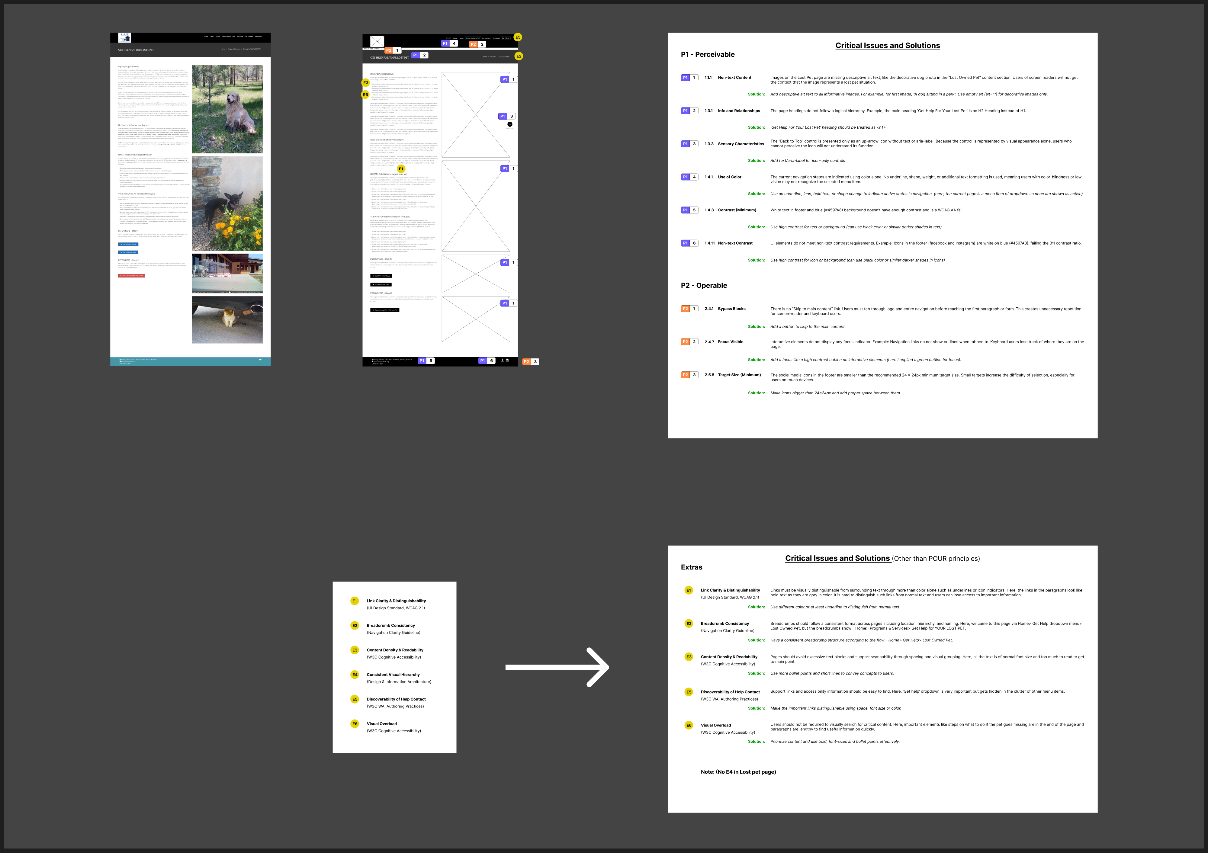
- Contrast & state
- Check text, meaningful icons, and control states against the relevant criteria; do not rely on color alone.
- Targets & input
- Review targets against SC 2.5.8, including its spacing provisions and exceptions. Identify the purpose of applicable personal-information fields.
Scope matters: decorative graphics are not automatically subject to non-text contrast requirements. These recommendations require implementation checks; mockups alone cannot prove conformance.
AI helped explain the standard; the audit remained my evaluation.
- Objective
Interpret complex WCAG criteria in practical terms.
- AI contribution
GPT provided real-world examples; AI also supported analysis and documentation.
- My judgment
I applied the criteria to the reviewed pages and organized findings by barrier and priority.
- Result
Annotated findings and a remediation roadmap—not an AI certification or verified fix.
Impact
A prioritized accessibility roadmap.
The audit chart records 35 failures across the reviewed checks: 24 critical and 11 moderate. These are audit classifications, not resolved issues or measured user-impact gains.
Original audit summary
- Delivered evidence
- Three annotated Figma boards, a cross-page pattern analysis, severity classifications, and prioritized recommendations.
- Fix first
- Keyboard access and exits, visible focus and skip navigation, meaningful names and image alternatives, heading structure, and contrast.
- Fix next
- Target sizing/spacing and input-purpose metadata, with affected controls verified in context.
- Not established
- No verified production remediation, post-fix audit, assistive-technology retest, or measured improvement in rescue-service access is documented.
What I took forward
An accessibility finding becomes actionable when the barrier, affected interaction, criterion, and proposed fix are visible together. Repeated issues also point to shared-component work, not just page-by-page cleanup.
The original record includes a legal/compliance discussion. This case study presents a technical evaluation, not a legal determination or certification. All original assets and source links are preserved in the project evidence record.